Video tutorial on the Head Settings, Background, and Web Layout Options
Head Settings
|
Setting |
Description
|
|---|---|
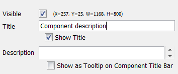
| Visible | Determines if the component should be visible in the application |
| (X=68, Y=165, W=300, H=300) | Shows the location (from the upper left corner) and size of component |
| Title | Specifies the title of the component. |
| Show Title | Determines if the title should be visible in the application. If the title is not visible, no title bar is shown – unless the setting Show as Tooltip on Component Title Bar (below) is checked, in which case the title bar is shown, but without a title. |
| Description | Specifies the component description. |
| Show as Tooltip on Component Title | Determines if the description should show as a tooltip on the component title bar. |
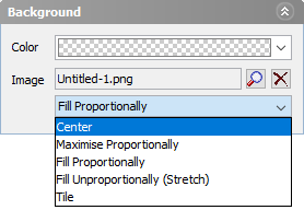
Background
Color specifies a background color, background colors will always fill the component. Overlapping components will be partly covered when using background color.
Image can be added as background as well, Select an already added image from inorigo or add one to a unit. Press the magnifier  and choose computer to upload a new image. Press Delete
  to remove the background.
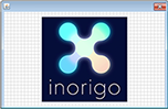
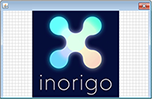
A background image can be scaled in the five ways displayed below.
Web Layout Options
Although these Layout options are available for all components, not all are applicable. Although visible in the Application, Search and Counter only applies to component that contains items, such as a Filter Component or a Matrix. Edit only applies to Filter Components.
- Enables the title bar. It must be visible to display a title bar Tooltip, the
 Search Button or the
  Menu.
Menu. - Enables the footer bar. It must be visible to display the Edit Buttons or the Counter.
- Enables the search field permanently under the title bar. Search Button can be used as a more compact alternative.
- Enables the counter of Selected / Total items in component. Only applicable for filter components.
- Enables the edit buttons permanently in the footer. Menu can be used as a more compact alternative.
- Enables the search button. The search button toggles a search field under the title bar.
- Enables the menu. Users reveal the menu by clicking the hamburger icon in the top-right corner. Available functions in the menu varies over components, editing settings and user rights.
- Compact is only applicable to Filter Components, the option replaces component box with a searchable drop down menu.
