
inorigo® Applications
Application Distribution
An inorigo® Application may be viewed in several ways on the web, such as:
- in the inorigo® Workbench
- embedded with HTML on a web page
- embedded in a Share Point
- embedded in Confluence
All embedded alternatives use a direct link to the Application to access it.
See the technical documentation on how to access Application definitions and data via the inorigo® web service interface.
When you embed an Application in a domain that is different from the Application domain, the browser might reject (not display) the Application unless the browser allows third party cookies or if the domain the Application stems from is exempt in the browser settings.
Example: The web page domain = yourdomain.com and the embedded Application stems from: someotherdomian.com
Obtain a Direct Link to an Application
To embed an inorigo® Application on the web, a direct link to the Application must be obtained. To obtain the link, right click an Application in the list of Applications in the Workbench and choose Open in new browser tab. In the window that appears, hit Ctrl-C to copy the URL to the clipboard.
inorigo® Workbench
All Applications are automatically available from within the inorigo® Workbench under Library – Applications (at the bottom of the Library sidebar).
Bookmark an Application to make it visible under Library – Bookmarks.
Double click an Application to open it in a tab in the Workbench.
To open an Application in a new browser window, right click the Application in the Library and choose Open in new browser window, or double click the Application tab header if the Application is already opened.
Note
The browser must allow popup windows to be able to open an Application in a new browser window. If popup windows are blocked, go to browser settings and allow popup windows.
Access Rights
When an Application is requested (from within the inorigo® Workbench or with a direct link) inorigo® verifies that the requesting user has the rights neccessary to access the View. If inorigo® is set to use single sign on (SSO), the verification and login process is done automatically. If not, username and password must be filled out manually. See Access Rights for detailed information on how to log in and log out of the Workbench.
Note
Users must exist in inorigo® to be able to view inorigo® content on the web!
Once logged in to the Workbench, only authorized Applications are visible. Requests for unauthorized Applications that are embedded (i.e. with a direct link), prompts the user with the browser login dialog window.
How to Publish and Embed Applications
This section describes step by step how to distribute your Applications in a web environment.
If you want to distribute an Application with a technique not listed below please read how to extract the Application URL: With plain HTML and consult the appropriate documentation for your publishing environment.
Inorigo Workbench
How to publish an Application in the inorigo Workbench.
1) Create an Application according to To Define and Edit an Application
2) Assign view rights to the Application consumers: Access Rights to Applications
SharePoint
- Example below is referring to SharePoint 2013
- You need to have the proper knowledge and access to Sharepoint gadgets
1) Create an Application according to To Define and Edit an Application
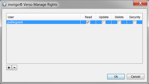
2) Assign view rights to the Application consumers: Manage Rights
3) in the Workbench right click on the Application and select Bookmarks
4) Edit the SharePoint page where you intend to embedd the Application
5) Select the INSERT tab – “Embed Code” in the menu
In the Pop up you need to paste the code in an iframe format:
 example:
Change the greyed out text with the link you copied from the Application and if necessary, modify other parameters such as Height and width to match the desired size of the window.
Confluence
How to publish an Application as content in Confluence
- The example below is referring to Confluence 5.1
- You need to have purchased the HTML plugin (not part of Confluence)
1) Create an Application according to To Define and Edit an Application
2) Assign view rights to the Application consumers: Access Rights to Applications
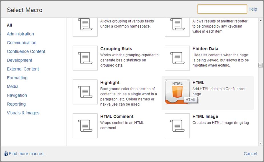
3) In Confluence insert a HTML macro by
a) clicking the insert button and selecting Other macros
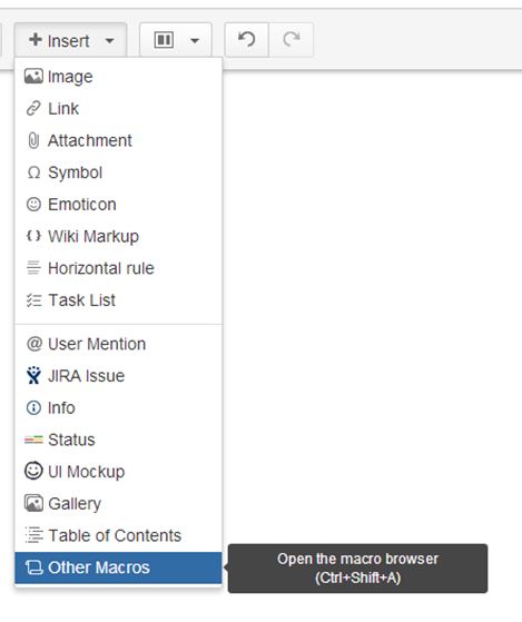
b) selecting the HTML macro
(adjust the height and with parameters to suite the embedded Application).
Distribute a Public Application
When you want to distribute an Application accesible to anyone.
Step-by-step guide
|
What
|
Step/-s
|
Picture/link
|
|---|---|---|
| Prerequisites |
|
These actions require System Administrator access. |
| Set rights |
|
|
| Construct the URL |
|
https://inorigodemo.ortelius.se/demo/verso?id=6630a11c-e8e8-049d-edbe-a32f00e75fEAB
https://inorigodemo.ortelius.se/demo/public/verso?id=6630a11c-e8e8-049d-edbe-a32f00e75fEAB |
| Distribute link |
|
When you distrubute a public Application note the following:
When a user with access rights to inorigo, who opens an Application in public mode, is logged in with it’s own user rights, not the rights of the guest user account.
Application Display Modes
Display Modes has been introduced in order to easily control Application layout.
This will set the visibility of its main components Title, Toolbar, User and Footer according to the
matrix below.
| Component | |||||
|---|---|---|---|---|---|
| Mode | Title | Toolbar | Footer | User | Remark |
| Browser | true | true | true | true | Default when an Application is opened in a separate browser tab. |
| Component | false | false | true | false | Default when an Application Component is opened in a separate browser tab. |
| Embedded | false | true | false | false | Default when an Application is embedded within an other Application (The Web Page component). |
| Gadget | false | true | false | false | Default when an Application is displayed within the inorigo Workbench. |
| Portlet | true | true | true | true | Use this mode when displaying an Application as a portlet within an external web page. |
| Stripped | false | false | false | false | Use this mode in order to show only the actual content of an Application. |
When these Display Mode parameters are added to the URL default display settings are overruled.
Example
Add the modes by adding
Example: …/public/verso/9b5efd39-92d3-cdbd-dbf9-a8fc00ae30a0?DisplayMode=Browser
Override
To override the default settings for each Display Mode simply supply separate parameters for each component.
Examples
…/public/verso/9b5efd39-92d3-cdbd-dbf9-a8fc00ae30a0?DisplayMode=Browser&Toolbar=False&Footer=False
…/public/verso/9b5efd39-92d3-cdbd-dbf9-a8fc00ae30a0?Toolbar=False&User=False
Deprecated
To use Application Display Modes, please remove all other settings (i.e standalone, showheader etc) since these are deprecated and might not work in future releases.
Selection directly in URL
Introducing a new way of sharing information with colleges; send them a link to an Application with a predefined set of selections or store in Favourites in browser for quick and easy access the next time.
You can use any filter box that has a unique identifier (pX) for your selection.
How to:
- Open the Application in a new browser window
- to the URL, add box id. and a value as query string parameter to select item. Repeat &pX=value for each new item in selection (replace X with the filter box id).
- To lock the selection, simply add parameter &lock=true
Values can be supplied as Text representation or as unique identifier. Value should never contain spaces since this is considered an invalid URL. Replace space with %20 which is supported by all browsers.
Example:
An Application holds a filter box with continents (p0) countries (p1) and a map. Open the Application in new browser window and add selection according to:
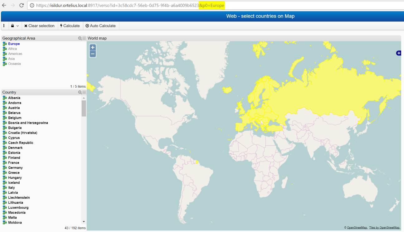
Use either p0 or p1 to perform selection
And yet more; since all the filter boxes have unique identities, they will be available for URL selections regardless of which tab they reside. One can thus make a composite selection from several tabs for distribution.
Distribute Application
Confluence
How to publish an Application as content in Confluence
- The example below is referring to Confluence 5.1
- You need to have purchased the HTML plugin (not part of Confluence)
1) Create an Application according to To Define and Edit an Application
2) Assign view rights to the Application consumers: Access Rights to Applications
3) In Confluence insert a HTML macro by
a) clicking the insert button and selecting Other macros
b) selecting the HTML macro
4) In the macro use and the Application URL. Se example below. Syntax details are found at: htmlquick.com

inorigo Workbench
How to publish an Application in the inorigo Portal.
1) Create an Application according to To Define and Edit an Application
2) Assign view rights to the Application consumers: Access Rights to Applications
SharePoint
- Example below is referring to SharePoint 2013
- You need to have the proper knowledge and access to Sharepoint gadgets
1) Create an Application according to To Define and Edit an Application
2) Assign view rights to the Application consumers: Manage Rights
3) On the web portal right click on the Application and select option inorigo® Portal Bookmarks
4) Edit the SharePoint page where you intend to embedd the Application
5) Select the INSERT tab – “Embed Code” in the menu
In the Pop up you need to paste the code in an iframe format:
example:
Change the greyed out text with the link you copied from the Application and if necessary, modify other parameters such as Height and width to match the desired size of the window.
With plain HTML
How to publish an Application as content in a web page.
1) Create an Application
2) Assign view rights to the Application consumers
3) In the inorigo Workbench, right click on the Application and select Open in new browser tab and copy the URL from there.
4) Paste the URL paste it within a html iframe tag using the format below.
<iframe src=”webpage address” width=”750px” height=”640px”><span data-mce-type=”bookmark” style=”display: inline-block; width: 0px; overflow: hidden; line-height: 0;” class=”mce_SELRES_start”></span><span data-mce-type=”bookmark” style=”display: inline-block; width: 0px; overflow: hidden; line-height: 0;” class=”mce_SELRES_start”></span>border:none;</iframe>
adjust the height and width parameters to the embedded Application
Web component distribution
All web components visible with header will have a partly hidden option to open them in a new browser tab. Just double-click the header to do just that. The component will be opened in a new tab in browser with its own unique URL, which can be distributed to any user since /public will be included in URL.
This is very useful when sharing charts or any other Result component, since it is updated live while performing new selections in the filter component(s) connected with it.
Application Components
Filter Component on the Web
Filter Component example.
Filter component menu
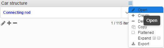
Click the  in the filter component title bar to expand component tools. The available and visible tools may differentiate between filter components.
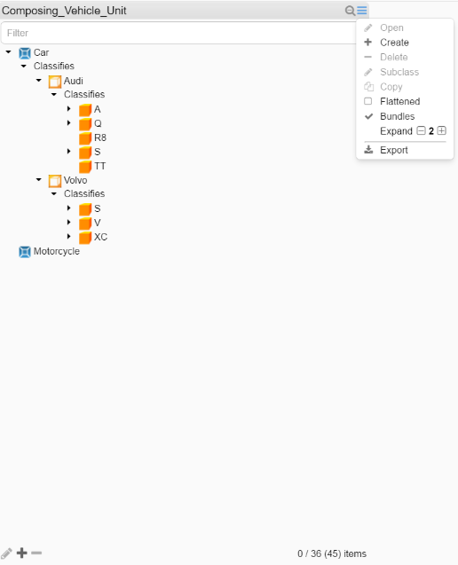
The functions available are:
|
Function
|
Description
|
|---|---|
 |
Filter field allowing for searching/filtering the component content.
Filter will ignore Locale setting while filtering numbers, i.e thousand separator white space and comma will be ignored. The inorigo® Application Builder layout setting Search field visible decides whether or not the search filter by default should be visible or hidden. |
 |
Open the selected object in Attribute Value panel |
 |
Create a new object |
 |
Delete the selected object |
 |
Create a new subclass to the selected object. |
 |
Copy the selected object |
 |
Bookmark the selected object. Note; this requires the Application to be opened in new tab in the Workbench |
 |
The list is “hierarchical”. Clicking it displays the content in a flat list. |
 |
Show or hide the relation between objects in hierarchical – Recursive – structure |
 |
Expands and collapses hierarchical node trees |
 |
Exports the filter component contents to MS Excel; all content when nothing is selected or just the selected items |
 |
Open/Edit, Create and Delete buttons |
 |
Shows number of selected items/total and (filtered) number of items visible in the box.
The inorigo® Application Builder layout setting Counter Visible and Footer Visible will decide if this is visible on web. |
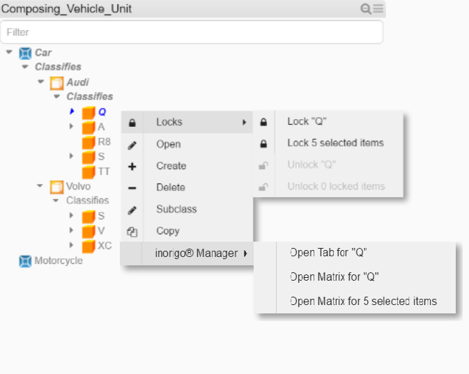
Filter component context menu
Some of these options are also available from the context menu in filter components, revealed by right clicking units inside the filter component.
|
Function
|
Description
|
|---|---|
 |
Reveals lock menu |
 |
Open the selected object in Attribute Value panel |
 |
Create a new object |
 |
Delete the selected object |
 |
Create a new subclass to the selected object |
 |
Copy the selected object |
 |
This option will open the selected item in inorigo® Model Builder |
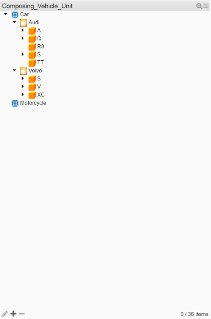
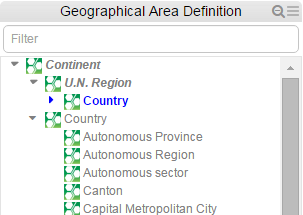
When a filter component displays any structure (Composition, Classification or Recursive structure), the parent nodes are indicated with a triangle pointing down (open) or right (closed)
Note
Filter components containing external links cannot be used for filtering content in other components. When selecting an external link the browser opens the link destination instead.
Compact
Designer should be aware of the following when defining a Filter component as Compact:
- does not support Classification or Composition structures, i.e. only flat.
- does not support multiple selections
- does not support context menu when managing inorigo® objects, options are only available from Menu and Buttons
While searching the Compact Filter component, indicators help you navigate and orientate in the list:
The criteria used when evaluating the filter search is Contains, just as in an ordinary Filter Component.
Calculation Box on the Web
A Calculation Box example.
The calculation box show calculations based on information in other filter components in the Application and in the underlying information model.
More information about setting up the calculation box, or embedding an HTML page inside it is available under calculation box in the application builder documentation.
Selection Box on the Web
The web version of Selection Box supports all features available in settings as described in section Selection Box under Working with inorigo Application Builder
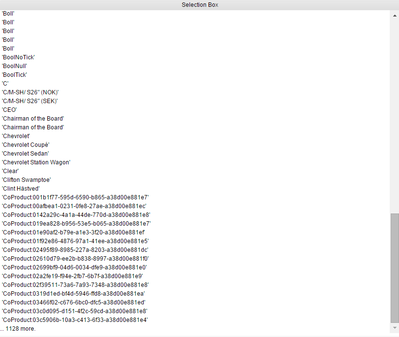
Example of Selection Box
Selection Box is now limited to show a maximum of 100 items per Filter Box. A trailing overflow item will be added if the limit is reached.
Image Display
An Image is a static picture, for example a company logo, placed in an Application. Selections or other user interactions cannot affect images inside an image component.
Note
The Image component should not be confused with the Resource Viewer.
Text Area on the Web
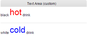
Example of a custom Text Area on the web
The Text area component contains static text like information, headers, etc. Selections or other user interactions cannot affect the text inside the component. The header of the component is often hidden to hide the component window and display only the text in the Application.
Resource viewer on the Web
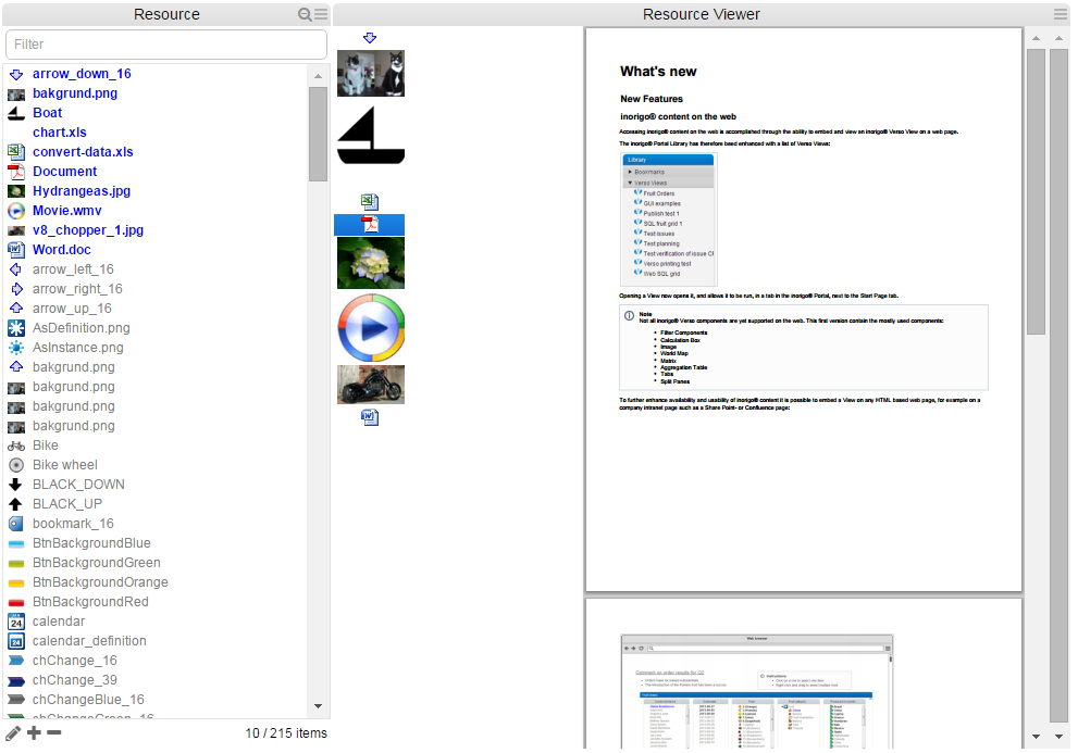
Resource viewer example, browser supporting the source format for direct display.
The Resource window to the left is a normal Filter component.
Resource Viewer component to the right has two parts; the left one listing the result of the selection made in Filter component, and the right displaying the result of clicking on an item in the list, this is configurable in the Layout settings in inorigo® Application Builder. External documents supported for direct view in Resource viewer is currently pdf files and xls charts.
Browser capabilities
The display of resources are depending of browser capabilities, installed plugins etc. A context menu offers a limited set of choices that are available in the current state, or context, of the Resource viewer. The available choices are actions related to the selected object, as it would do in the example below, when performing a mouse right-click on the icon that represents the object not being displayed.
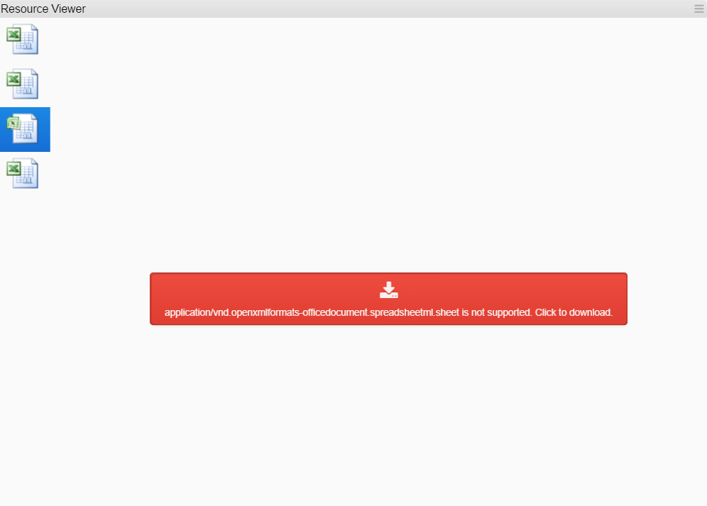
Another Resource viewer example, browser not supporting the source format for direct display, click the red area to download for view in a default program associated with the file type.
Click the  in the top right corner of resource viewer title bar to expand component tools.
The functions available are:
|
Symbol
|
Function
|
|---|---|
 |
When ticked, the object being displayed is adjusted to the available viewer area . |
 |
Download the resource |
World Map on the Web
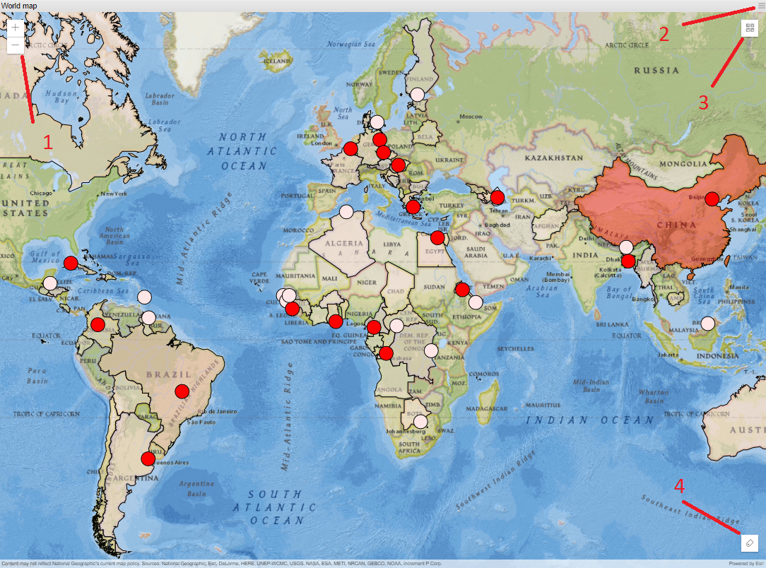
A World Map Example (with a few countries and major cities selected). In this map, Heat variable is used based on population, which is indicated by the different colors of the plotted items.
The World Map highlights countries selected in a filter component with countries (it is not possible to select countries directly in the map).
Zoom in and out by using the zoom buttons in the upper left corner (1),  for zooming in and
  for zooming out. Another way to perform zoom is to use the scroll wheel on mouse. To pan the map, press the left mouse button and hold it down while moving.
In 3D mode there are additional tools available;  is used for tilting the Application,
  is the default top-down view for panning and zooming and
  shows the orientation of map, where the dark arrow is north.
Based on the selection and zoom level, the map will try its best to adjust pan and zoom to show the selected items. This will of course work better in 2D than 3D.
In the upper right side of map (2), there are menu options available to customize the map content, accessible via

Toggle 2D/3D map and hide/show layers.
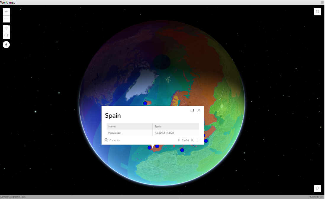
A 3D map example, where one selected item has been clicked and shows the Info panel. The Info panel can be configured to show any data using expressions.
The Info panel is updated when another item is clicked in the map.
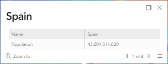
The contents and features of the Info panel:
|
What
|
Description
|
|---|---|
|
|
Docks the Info panel to the upper right corner of map |
|
|
Close the panel |
|
|
Zoom in to the selected object |
|
|
When many layers (areas) are put on top of each other, it is possible to select the layer to show info for by clicking arrow (only works in 3D) |
|
|
Same as previous, a menu to select layer display info (only works in 3D) |
The other menu (3) in the upper right corner of map, gives the possibility to change the base map used as background and there are 10 different to choose from, accessible via the menu  . This setting is not permanent; a refresh of the Application will restore the original Base map.
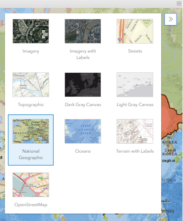
Different Base map options
If Heat variable is used on the plotted items in map, the Legend of the variable is available via 
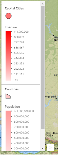
Map Legend(s)
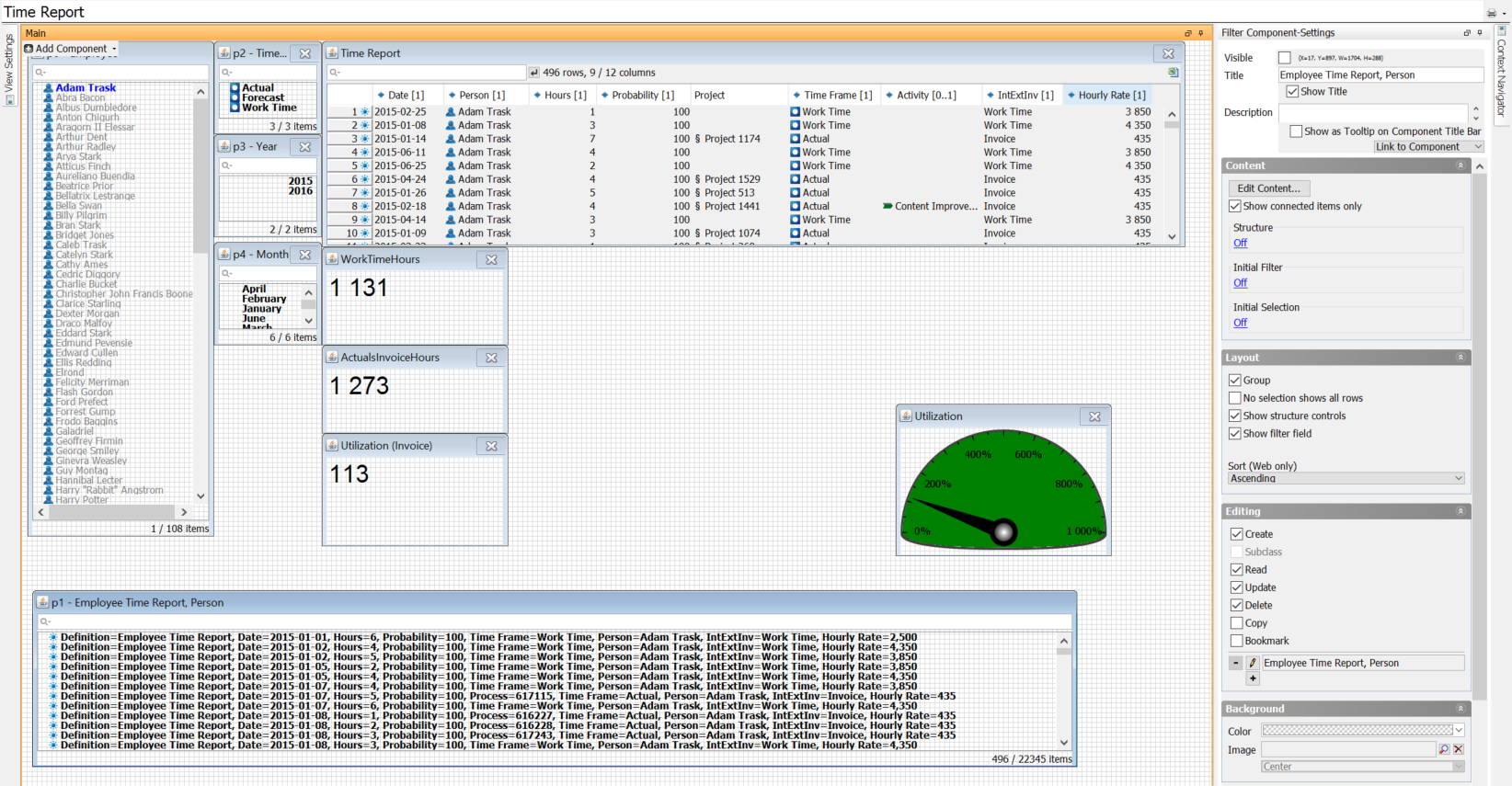
Charts on the Web
The purpose of the charts is to display the information from the filter components to present the information in a graphical and useful way.
Bar Chart
All settings available for inorigo® Application Builder Bar charts are also applied in the Application on web. Charts are populated with data from any Filter component as specified in Content Settings, in inorigo® Application Builder:
| X-Axis Values | Specifies, with an expression, where the values on the x-axis comes from. |
| Y-Axis Values | Specifies, with an expression, where the values on the y-axis comes from. The y-axis can handle numerical values as well as numerical strings, i.e. strings that contain only numerical figures. |
An example of a Bar chart
Hover
Moving the mouse over a bar in the chart will reveal the object properties as specified in settings in Application Builder.
Select
A mouse left-click on a bar in chart will outline the object. It is possible to select several bars combining the mouse left-click with Ctrl-button.
Chart warnings
Using chart Fixed Axis displays warnings on each Bar exceeding the minimum and maximum preset in configuration, see example below.
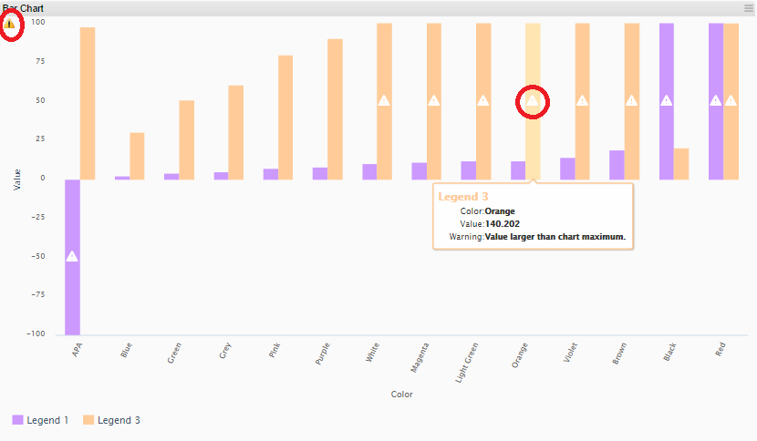
There are three indicators on web, one for each Bar and the tooltip, and the third in upper left corner that returns a summary for the entire chart.
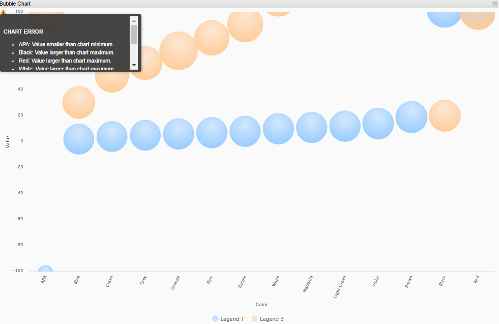
Bubble Chart
All settings available for inorigo® Application Builder Bubble charts are applied in the Application on web. Charts are populated with data from any Filter component as specified in Content Settings, in inorigo® Application Builder:
| X-Axis Values | Specifies, with an expression, where the values on the x-axis comes from. |
| Y-Axis Values | Specifies, with an expression, where the values on the y-axis comes from. The y-axis can handle numerical values as well as numerical strings, i.e. strings that contain only numerical figures. |
| Bubble Size | Specifies, with an expression, where the values for the bubble size comes from |
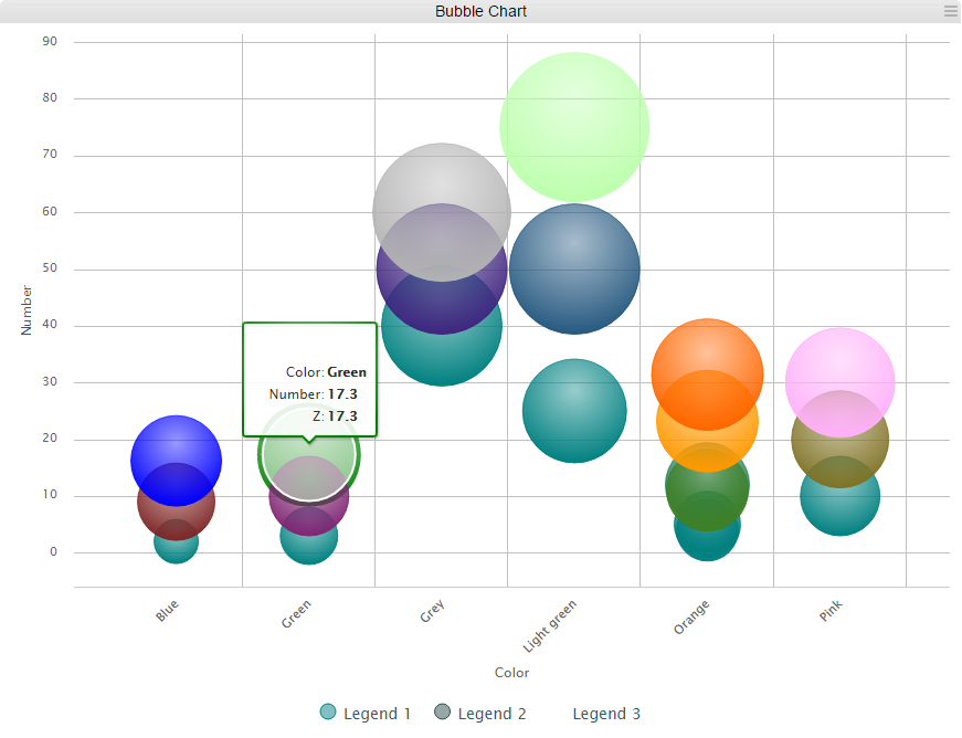
Example of a Bubble chart
Hover
Moving the mouse over a bar in the chart will reveal the object properties as specified in settings in Application Builder.
Select
A mouse left-click on a bubble in chart will outline the object. It is possible to select several bubbles combining the mouse left-click with Ctrl-button.
Chart warnings
Using chart Fixed Axis display a warning icon in upper left corner that contains information on each value exceeding the minimum or maximum preset in configuration, see example below.
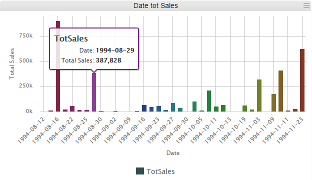
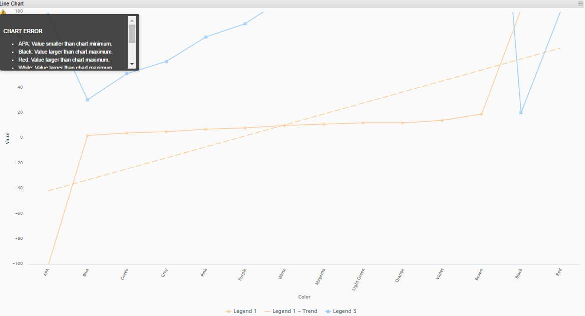
Line Chart
All settings available for inorigo® Application Builder Line chart are applied in the Application on web. Charts are populated with data from any Filter component as specified in Content Settings, in inorigo® Application Builder:
| X-Axis Values | Specifies, with an expression, where the values on the x-axis comes from. |
| Y-Axis Values | Specifies, with an expression, where the values on the y-axis comes from. The y-axis can handle numerical values as well as numerical strings, i.e. strings that contain only numerical figures. |
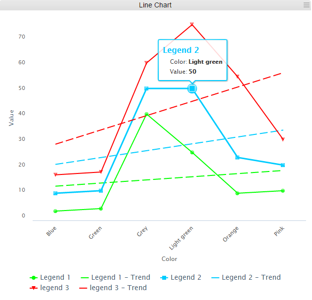
Example of a Line chart
Hover
Moving the mouse over a (trend) line in the chart will reveal the object properties as specified in settings in Application Builder.
Select
A mouse left-click on a dot in chart will outline the object. It is possible to select several dots combining the mouse left-click with Ctrl-button.
Chart warnings
Using chart Fixed Axis display a warning icon in upper left corner that contains information on each value exceeding the minimum or maximum preset in configuration, see example below.
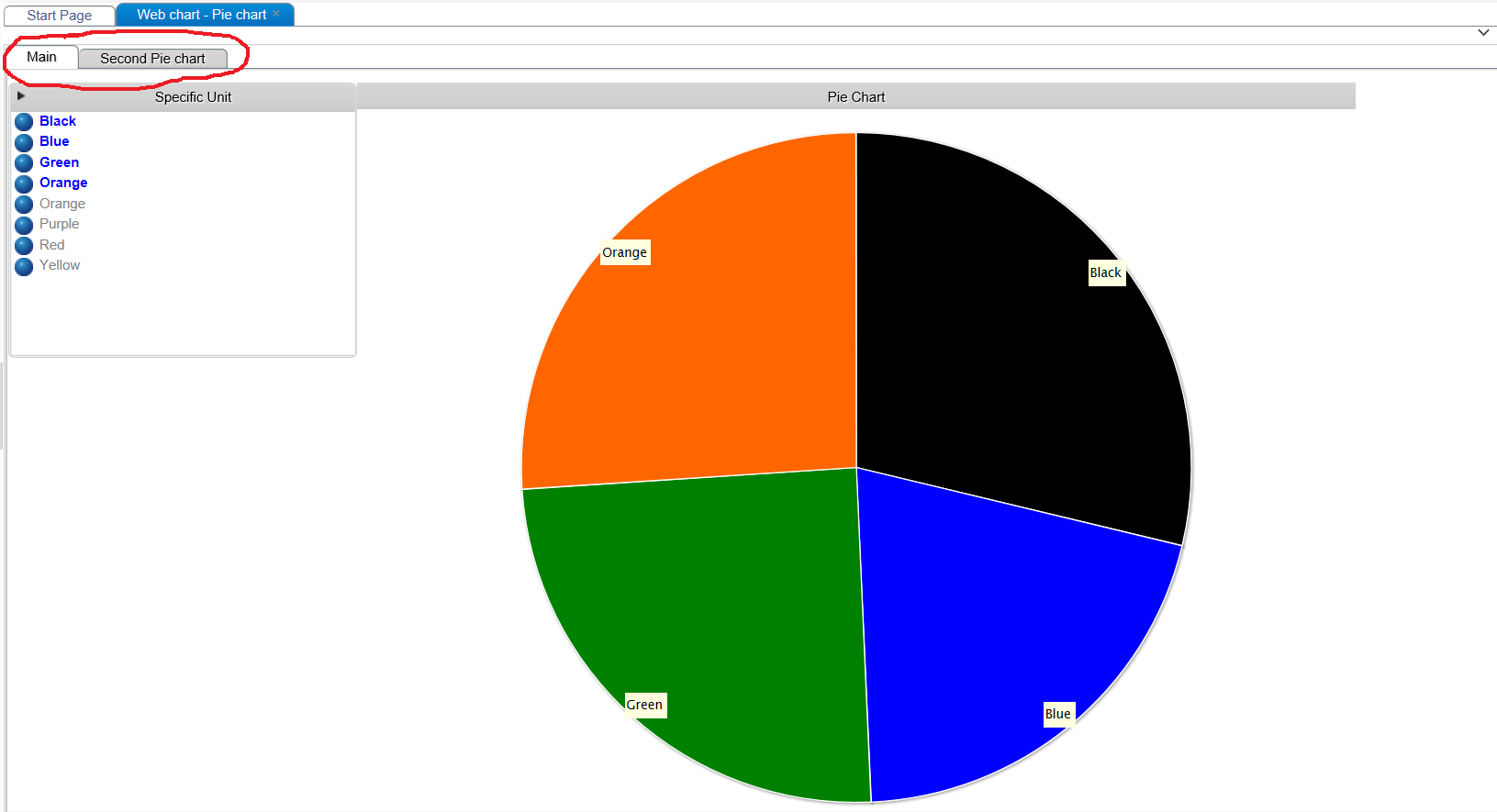
Pie Chart
Video tutorial on the Pie Chart Component
All settings available for inorigo® Application Builder Pie chart are applied in the Application on web. Charts are populated with data from any Filter component as specified in Content Settings, in inorigo® Application Builder:
| Sector Names | Specifies, with an expression, where the name of the sectors come from. |
| Sector Values | Specifies, with an expression, where the values (the size of the sectors) come from. |
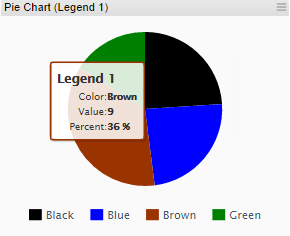
An example of a Pie chart
Hover
Moving the mouse over a segment in the chart will reveal the object properties as specified in settings in legacy Application Builder.
Select
A mouse left-click on a segment in chart will explode the object. It is possible to select several segments combining the mouse left-click with Ctrl-button.
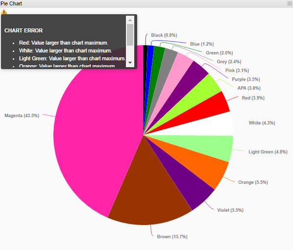
Chart warning
Using chart Fixed Axis display a warning icon in upper left corner that contains information on each value exceeding the minimum or maximum preset in configuration, see example below.
Meter
Video tutorial on the Meter Chart component
All settings available for inorigo® Application Builder Meter charts are applied in the Application on web. Charts are populated with data from any Filter component as specified in Content Settings, in inorigo® Application Builder:
| Value | Specifies, with an expression, where the value (shown with the meter hand) comes from. If several values are selected, the values are summarized. |
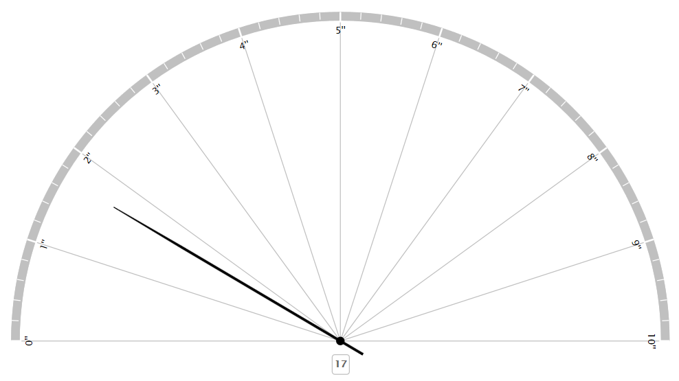
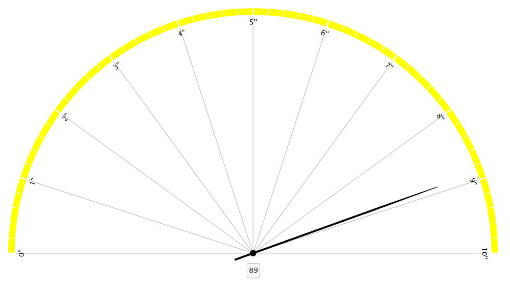
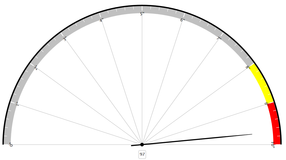
Examples of a Meter chart
Error in Chart
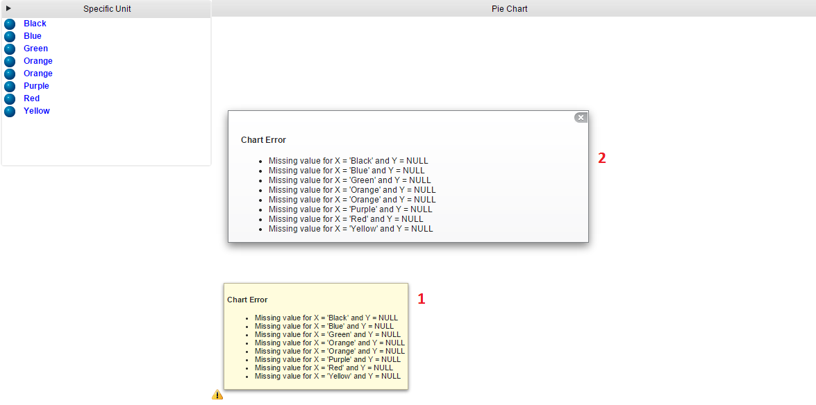
An error in a chart on the web is indicated by a small icon in lower left corner of the chart.
There are two ways to get information about the error, either hover the cursor over the icon to get a quick overview of the problem described by (1), or click on the icon to get a fix display of error displayed by (2).
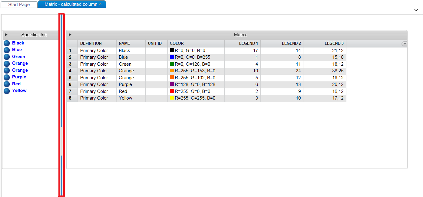
Matrix on the Web

A Matrix example.
Sorting
To sort the data, click the column heading you want to order by. The first click will set up a sort of ascending type ( ). A second click on the same header will change the sort to descending (
 ) and a third ends the sort on that column.
To sort rows based on many columns at the same time, hold down CTRL and click as described above. There is no limit to how many additional sorts you can apply.
Note that the sorting you set up wont effect coming changes to cells and rows. The way to reenact the sorting is simply to redo the clicking of column headers you want to order by.
Click the Matrix menu  at the rightmost column header position to hide (and show) columns.

Visible column are indicated in the list with a tick mark.
Click the  in the top right corner to expand the component tools.
The functions available are:
Aggregation tables can now be sorted by the user on multiple columns by clicking on the column headers. Users may also clear the sorting through the menu command reset sorting.
Tooltips
A Matrix has the option to display tooltips for each individual cell. Click or hover a matrix cell to reveal a given tooltip.
Symbols
|
Symbol
|
Function
|
|---|---|
 |
Excel export, will export the Matrix content to a new MS Excel file. |
 |
Selected rows / total number of rows (filtered number of rows)
It is possible to right-click an object in the Matrix, and Open the selected object in Model Builder. |
 |
Open the filter field that enables filtering of the Matrix content. |
 |
Close and clear the filter field |
 |
Reset sorting on in all columns |
Note
In order to access the component tools, the setting Show Title must be checked in the Application definition.
Aggregation Table on the Web
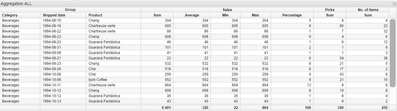
An aggregation table example.
Click in the top right corner to expand the Aggregation table tools.
|
Symbol
|
Description
|
|---|---|
|
Excel export, the table content is exported to Excel. |
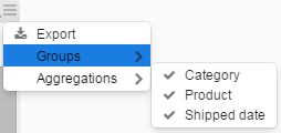 |
A menu with a list of grouping column names are displayed. By checking or unchecking the visibility is altered. |
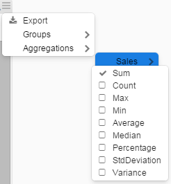 |
A menu with a list of calculations that can be performed on the Aggregation column(s). By checking or unchecking the visibility is altered. |
Aggregation tables can now be sorted by the user on multiple columns by clicking on the column headers. Users may also clear the sorting through the menu command reset sorting.
Tabs
An example with two Tabs.
Tabs are defined and managed in inorigo® Application Builder.
Note
Web Application Tabs are displayed at the upper part of the Application (as opposed to Tabs in inorigo® Application Builder, that display the Tabs at the lower part of the Application).
It is not possible to move or rearrange the Tabs in an Application on web.
Split Panes
A Split Pane separates different Application groups with a Split Bar, indicated with a red rectangle in example above, and is created when groups are placed adjacent to each other while defining the Application in Application Builder.
Hovering over a Split Bar displays a double arrow,  , indicating that it may be moved to change group proportions.
Application Tools
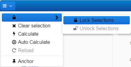
Lock Selection(s)
Context menu contains two options for Lock/Unlock depending on the state in which the item in Filter box is. “Lock…” is available when items are selected but not locked, while “Unlock…” is available for items being locked.
The two options in context menu are:
- Lock the item that was right-clicked to open context menu
- Lock all selected items
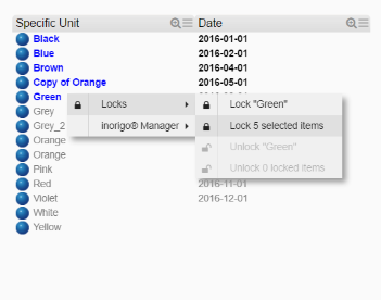
Locks all items simultaneously
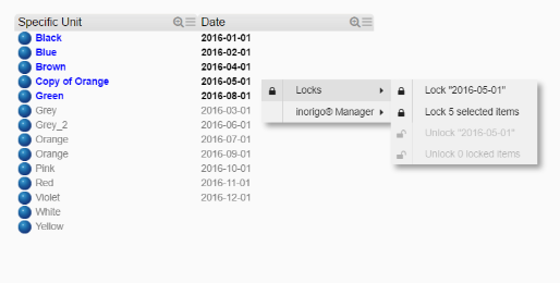
Lock and Unlock is also available for implicit selected items
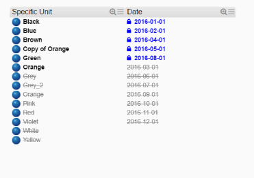
Objects not part of a selection Lock will get a strike through and dimmed to enhance this; they can not be selected or locked. The implicit selected items can be locked.
If the Group setting is on, blocked items are sorted after un-selectable items.
The Lock options are also available from the Application toolbar.
Open Item in inorigo® Model Builder
If user has access, the selected item will be opened and displayed in inorigo® Model Builder. The options are only available for items that have an identity in the database.
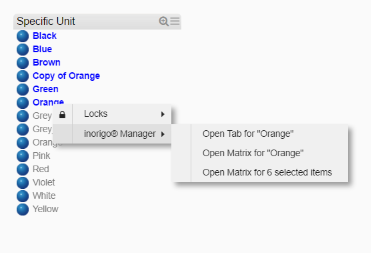
The context menu options are available for any kind of inorigo® item, explicit or implicit selected or not selected at all. The Model Builder application will be focused when items are opened.
User access
It is required that the user has the authority to view content in the inorigo® Model Builder instance where requested information resides.
Unlock Selection(s)
Use the appropriate option from the context menu to unlock object(s).
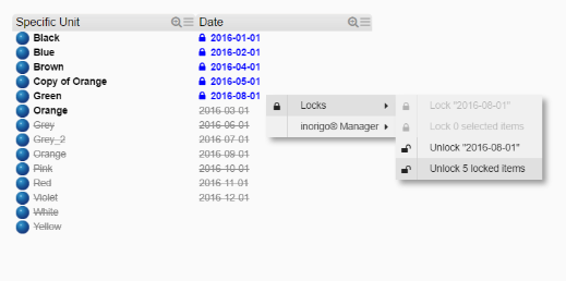
Unlock objects one by one or unlock all at the same time
The Unlock options are also available from Application toolbar.
Show Description as Tooltip
Title bar tooltip is supported for all types of components. It can be set, enabled, or disabled through the Application Builder
Toolbar on the Web
The Toolbar is by default available when an Application is opened.

By clicking the three vertical dots to the left, the Toolbar is minimized in Title bar:
Note: The minimize option is available when an Application is opened in a new browser tab.
All options are still available by moving the mouse pointer over the minimized toolbar icon:
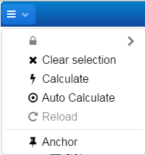
When pressing the Anchor, Toolbar will be restored to default.
Press the Clear selection button to clear all selections made in all Filter Components.
Press the Calculate button to execute the calculation boxes (only necessary if Auto Calculate is turned off).
Check the Auto Calculate option to automatically execute the calculation boxes for every selection change in the Filter Components. If the connection to the server is poor or if the Application has some heavy calculations, it is a better alternative to un-check the option and press the Calculate button manually.
Press the Reload button to refresh the Application.
The Lock symbol will become available once any selection is made in any Filter box:
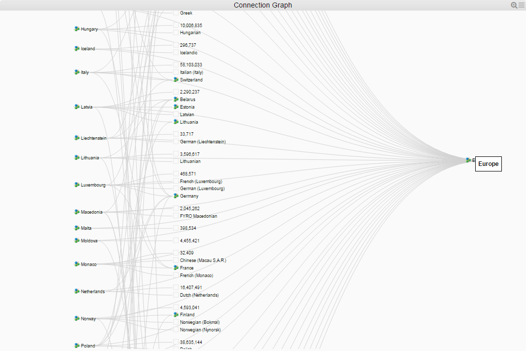
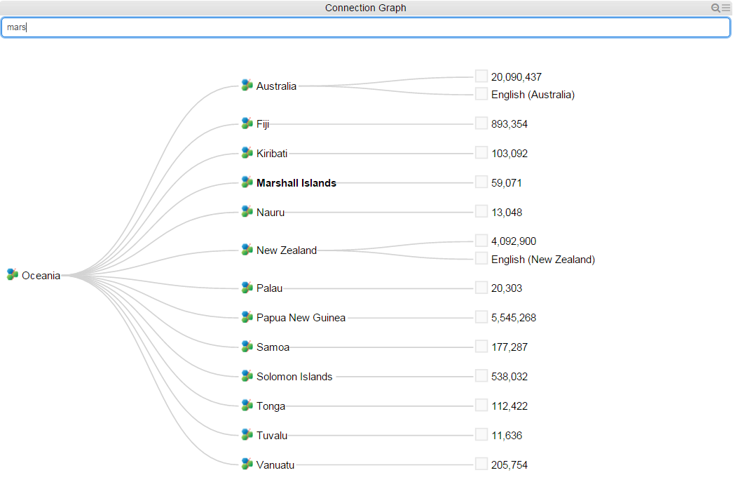
Connection Graph on the Web
The filter components which allows you to make selections of inorigo® data and displays the internal relations by colorizing the entries does and not show how many or between which objects the relation exist. The Connection Graph-component allows you to display the relations in a graphical manner also showing if there are several relations between the objects.
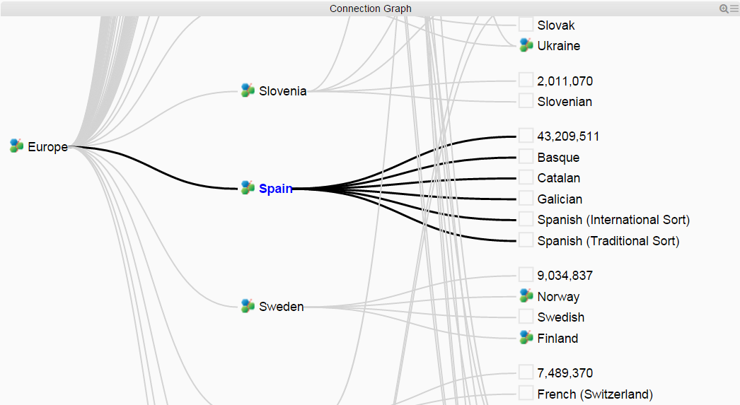
By default, connection graph is expanded, scale to fit the defined area and visualization is set Left to Right.
 The default mouse pointer symbol when managing objects in Connection graph box
 The default mouse pointer symbol while zooming and panning.
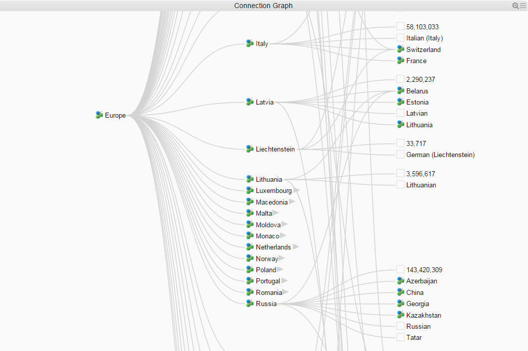
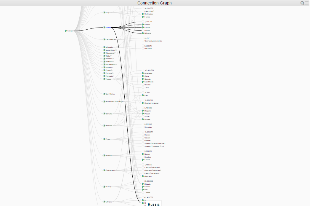
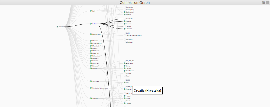
Connection Graph Features
Dragging objects
Point the mouse on an object in graph and the pointer will change to a hand. Drag the object in the graph to put it in another location. Connection lines will follow while dragging objects.
Collapse and expand
Expand and Collapse branches at users will simply by double-clicking any object in the graph. Any object having a child object attached can be collapsed.
Enhance objects selected by user
Objects and their connections in the graph can be enhanced by clicking an object in the graph. The enhanced object is visualized in bold blue with bold black connections.
Tooltip
Show the name of a hovered node as tooltip.
Zoom and Pan
While mouse pointer icon is an arrow, Zoom and Pan will work in entire graph box.
Zoom out: Shift + mouse double-click or scroll wheel on mouse.
Zoom in: mouse double-click or scroll wheel on mouse the opposite direction.
Pan: mouse-click and drag any direction
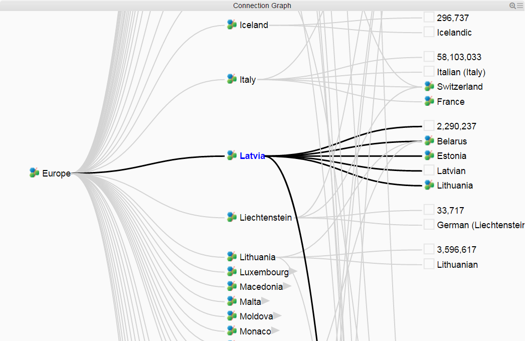
Sorting
The objects in Connection graph will always be sorted on text, from left to right or top-down, depending on the Application direction selected.
Connection Graph Toolbar
Visualization
Click the ( ) in the upper right corner to adjust the Application Left Right or Top Down.

Highlight
Enter letters in the Highlight box that would match any object in the Connection graph will highlight those object(s), see example below. The objects matching the highlight criteria will be marked black and bold.
To open the highlight filter press the ( ) icon, and to close and clear filter press the (
  ) icon in the right end of title bar.
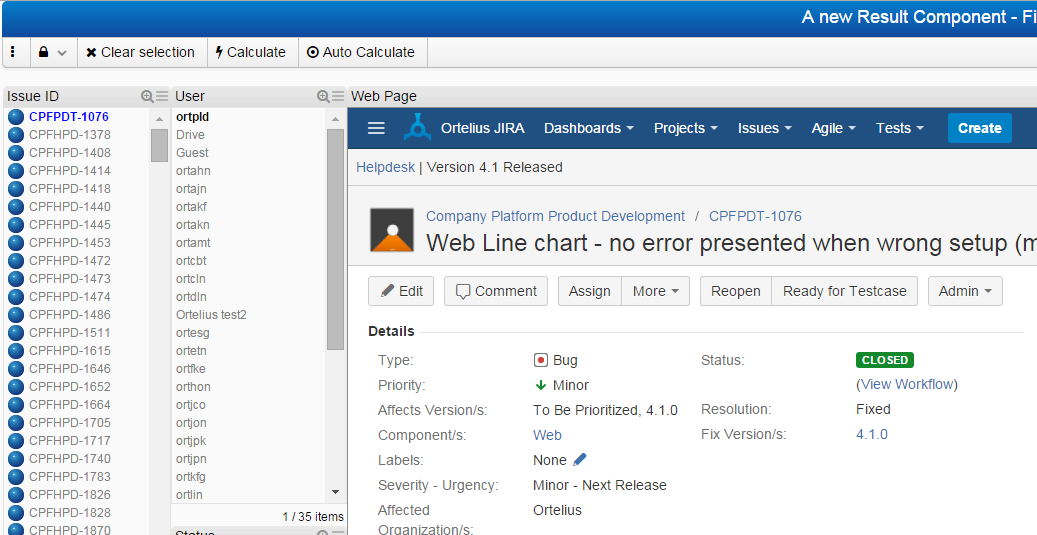
Web Page in Application
This example will display filtered data from JIRA issue application, some statistics for an overview of bugs.
Lets have a look at the example:
In Model Builder, create a Generic Unit with the following attributes:
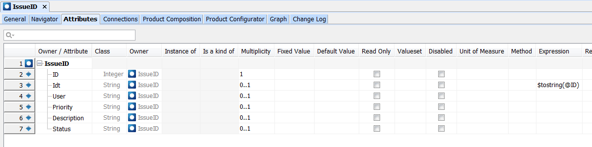
The data needed for the Specific Units is exported from JIRA and pasted into a Model Builder matrix.
Create an inorigo® Application:
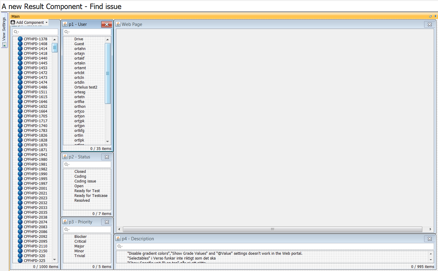
First thing will be to list the Specific units in a Filter component, and link to the other filter components needed from that one.
At last, add the Web Page Result component.
The only setting change needed for that is:
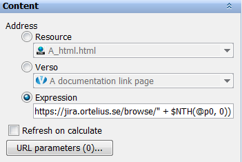
with an Expression as follows:
$IIF($SIZE(@p0) = 0, “”, “https://jira.ortelius.se/browse/” + $NTH(@p0, 0))
Explaining a bit about the expression; means that if nothing is selected, then show “” (nothing) in Web Page, else show base address https://jira.ortelius.se/browse/ + the selected item in p0 Filter component.
Test the setup by selecting an item in p0:
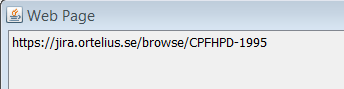
Web content is not supported by Application Builder
The address looks allright, lets save the Application and try on the web.
It works!
A few charts to get an overall picture of the statistics would be great, add another tab in Application Builder design and add 2 Bar charts, and here is the result:
(won’t get into details about the setting of charts)
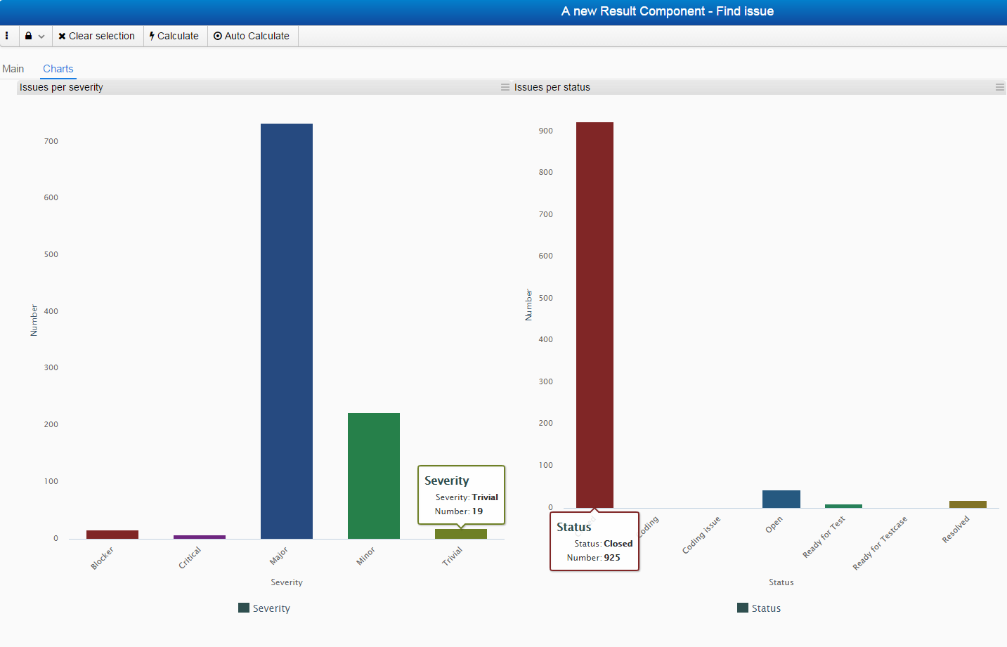
Resulting charts.
The Generic Model Attribute Value Panel
Attribute Value Panel
Known as the content unit General tab in inorigo® Model Builder.
The panel will allow designers to specify whether the content unit attributes in filter components may be viewed, edited and/or deleted, or if new content may be created. These CRUD-rights (Create, Read, Update, Delete) are set in the Application Builder settings panel and executed on the web. End users will be able to view and edit attribute values, one unit at a time, either in an Application or directly from a bookmark in the Workbench. This radically diminish need for updates via methods and the need to develop custom applications designed for updating purposes only.
|
Feature
|
Description
|
|---|---|
| Show attributes | Read, Create and Edit mode is supported in Inorigo® web, showing all attributes and their values as defined in Application Builder. Creating and updating an object on web is synchronized with inorigo® Model Builder and vice versa. |
| Add and Delete attribute values | On inorigo® Web, it is possible to Add and Delete attribute values as stipulated by rules in inorigo® Model Builder. If rules apply, icons for the actions are displayed. |
| Support classes | Inorigo® web supports all classes, Primitive and Information unit. |
| CRUD objects | On web, the context menu for a Filter box object holds several options as defined in Application Builder, Create, Read, Update and Delete. |
| Mandatory fields validation | Each attribute value is validated upon Save or when leaving field, as specified in inorigo® Model Builder. Mandatory field indication – a dashed red square – helps user to perform the required input along with the tooltip at field and Save button. |
| Bookmarks | From the Bookmarks list in Application on web, it is be possible to access Open, Open in Matrix in inorigo® Model Builder and Add/Remove Bookmark from the context menu.
Objects are opened in one of two modes depending on user rights controlled by inorigo® Model Builder, either Readonly or Edit mode. |
| Boolean attribute | A three state boolean is an inheritance from Model Builder, that enables support of not only True or False, but also undefined (Null). |
The Attribute Value Panel consists of fields for the unit icon and attribute values.
Icon
If the unit does not have an icon of its own, it automatically inherits it from its unit (shown as a link). Press the icon link to open that unit. Inherited icons may not be deleted, only overridden. To override an icon, press the icon image. This brings up an image load window, see below.
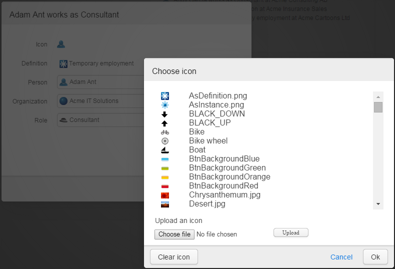
Searching for the image brings up the search window. It is possible to select an image from the list or uploading an image from elsewhere, e.g. on the personal computer, which brings up a standard Windows open dialog to enable upload of images.
The image uploaded is stored in the Resource unit of the Generic domain, where it may be administrated as any other unit.
Attribute values
If an attribute allows more than one value, adding new ones is done by clicking on the plus button ( ). The plus button disappears when maximum concurrencies have been entered. If the plus button doesn’t show at all, only one occurrence is allowed.
Attribute values are deleted by clicking on the minus icon ( ).
).
These symbols might not be available for the following reasons:
- Attribute is read only
- + sign is disabled when additional values are not allowed
- – sign is disabled when value cannot be deleted
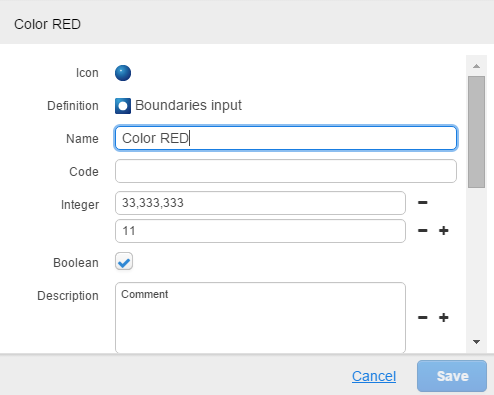
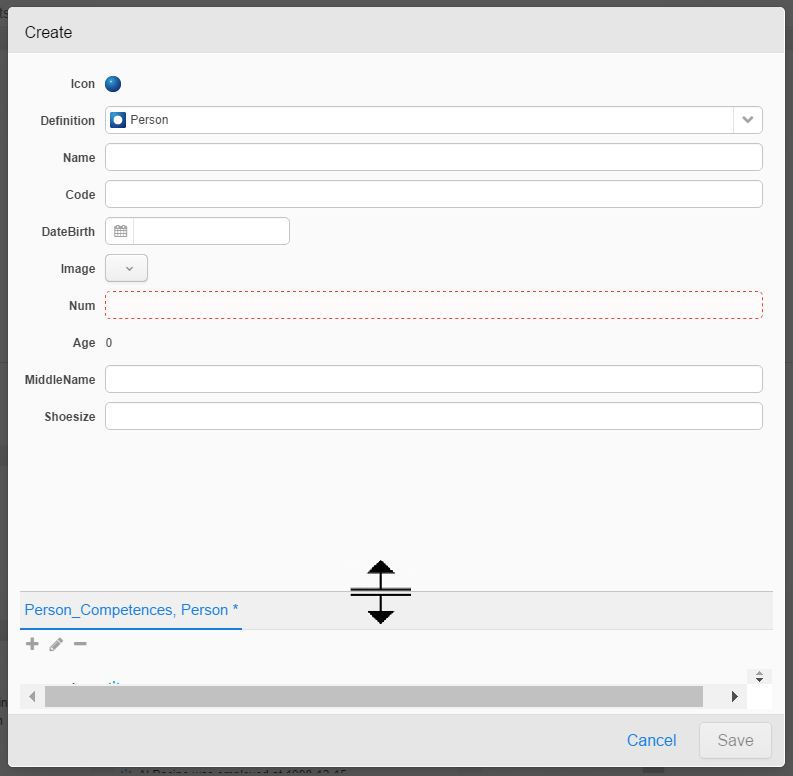
Mandatory fields are framed in red, and when hovering the field, a tooltip will pop up.
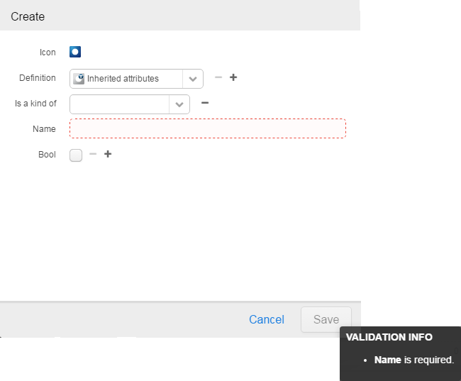
The Save button will not be enabled until all mandatory values have been entered. When hovering the Save button, all missing mandatory attributes will be listed, as illustrated in picture below:
External Link
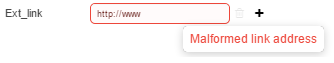
If an attribute has the type External Link, you are able to open the link by left clicking on the field (in read-only mode). If the value cannot be validated it will be indicated with a red box around the attribute, value.
Size and position of panel
The size of the Attribute Value Panel can be changed, and the setting is automatically stored locally on client computer.
Position
The panel is always centered. This will ensure the panel is always visible.
Size
Grab the lower right corner of the panel – when mouse pointer change style to a “Diagonal Resize” type – and then drag panel while holding down mouse left-click button in any direction until the desired size is achieved.
Divider
The divider between object attributes and the Nested Units can be moved by hovering the panel
Generic Model Information Units
How to work in the Generic Model domain
The Generic Model-domain was originally the Product-domain and is especially suited for product configuration needs. The best way to effectively define, maintain and evolve business products is to start defining very generic products on a high abstraction level.
The Generic Model-domain is suitable for all information and you should not restrict the use of this domain to only contain product definitions and instances. It also contains the Association-object which can associate (or link) any type of inorigo® entities (even from other information domains) and be able to change appearance depending on the view perspective. This feature allows you to create powerful information models that are able to resolve and refine information directly presented to the user of inorigo® Model Builder.
Since the Generic Model-domain is much more flexible than the other information domains, it is recommended that you use this information domain for all types of entities. You are for instance not able to specify arbitrary relations between entities which are from different domains. In a future version of inorigo® you should not be constrained to the pre-defined information domains, but rather be able to create your own.
Generic Type
- Can not have definition
- Can, but must not have superclass (Generic Type)
- Can, but must not have subclasses (Generic Type)
- Can, but must not have instances (Generic Unit)
Generic Unit
- Can, but must not have definition (Generic Type)
- Can, but must not have superclass (Generic Unit)
- Can, but must not have subclasses (Generic Unit)
- Can, but must not have instances (Specific Unit)
Specific Unit
- Must have a definition (Generic Unit)
- Can not have subclasses
- Can not have instances
Association Definition
- Can not have definition
- Can, but must not have superclass (Association Definition)
- Can, but must not have subclasses (Association Definition)
- Can, but must not have instances (Association)
Association
- Must have a definition (Association Definition)
- Can not have subclasses
- Can not have instances
Resource
- Can not have subclasses
- Can not have instances
Managing General Model domain objects on the web
Unit’s management on the web
Inorigo® Application Builder configuration
Example: This is a very simple example
Common Component Settings Web
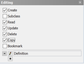
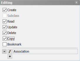
Authorization Settings, Associations
This settings panel is valid for Associations and their definitions. They will be explained in the following sections.
Association Definition
|
Setting
|
Description
|
|---|---|
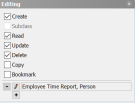
| Create | Authorized to create a new object |
| Subclass | Authorized to subclass, i.e. create sub levels of Association Definition(s) |
| Read | Authorized to view an object |
| Update | Authorized to update an object |
| Delete | Authorized to delete an object |
| Copy | Authorized to copy an object |
| Bookmark | Authorized to Bookmark an object |
Associations
|
Setting
|
Description
|
|---|---|
| Create | Authorized to create a new object. It is possible to define one or more definitions to use as a template for the new Association. When creating the new Association on the web, choose the appropriate Association Definition from a drop-down list. |
| Subclass | Not allowed |
| Read | Authorized to view an object |
| Update | Authorized to update an object |
| Delete | Authorized to delete an object |
| Copy | Authorized to copy an object |
| Bookmark | Authorized to Bookmark an object |
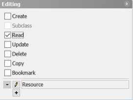
Authorization settings, Resources
This settings panel is valid for only Resources, since it cannot have a Definition nor Instances or Subclasses.
|
Setting
|
Description
|
|---|---|
| Create | Authorized to create a new object |
| Subclass | Not allowed |
| Read | Authorized to view an object |
| Update | Authorized to update an object |
| Delete | Authorized to delete an object |
| Copy | Authorized to copy an object |
| Bookmark | Authorized to Bookmark an object |
Bookmarks on Web
It is possible to Bookmark any inorigo object in any filter component when Authorization settings in inorigo® Application Builder allow. There are two ways of performing the operation; either right-click the object and use the Context menu to Bookmark, or use the Menu on title bar. Both alternatives produce the same result; Bookmark is created in the Bookmarks panel.
Please note that Bookmarks option is only available when an Application is opened in the inorigo® Workbench.
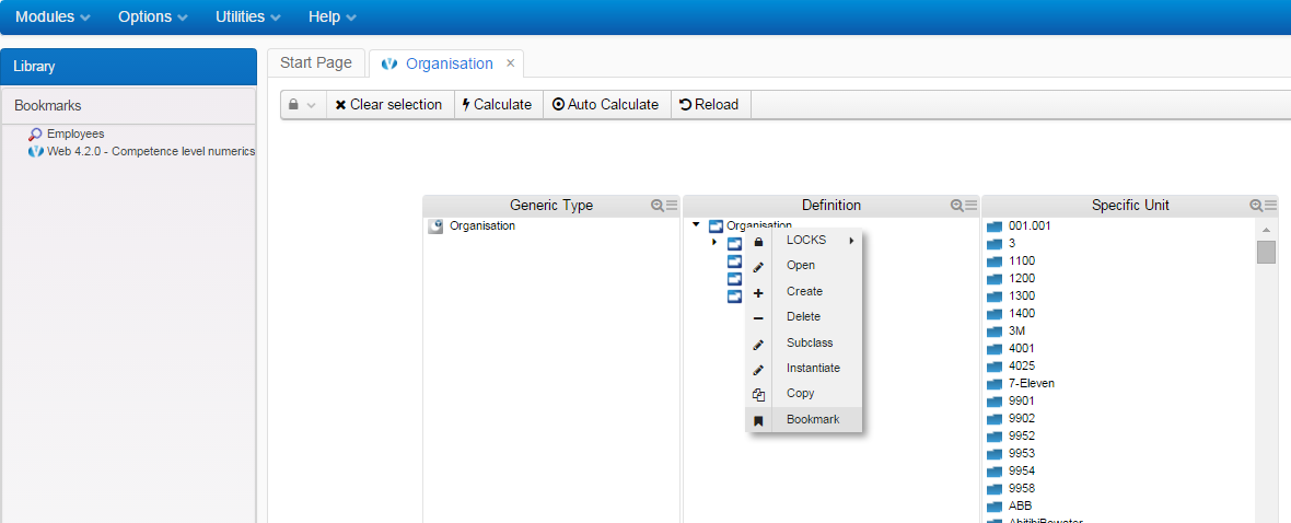
Create a Bookmark from the context menu
Create a Bookmark from the title bar Menu
Web Layout Options Settings
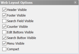
|
Option
|
Description
|
|---|---|
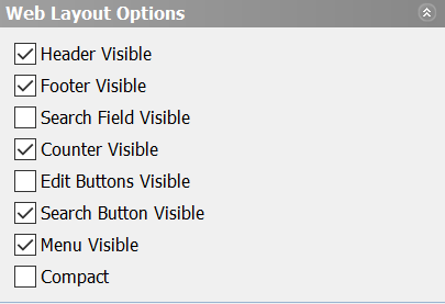
| Header Visible | Title bar visible or not |
| Footer Visible | Footer visible or not. This setting also have an effect on visibility for Counter and Edit buttons |
| Search Field Visible | Search field visible or not |
| Counter Visible | Counter visible or not. The counter show selected/all items in filter component.
It is required that Footer visibility is enabled. |
| Edit Buttons Visible | Edit buttons visible or not. It is required that Footer visibility is enabled.
These options availability is dependant of settings in Authorization . |
| Search Button Visible | Decides whether or not the Search field should be visible by default. There is a dependency to Header setting. |
| Menu Visible | This setting activates a Menu in the Header with the available options as defined in Authorization settings |
| Compact | Show the Filter component as a Combobox. Only applies on Filter components. |
Managing Associations and Their Definitions on the Web
It is assumed – when proceeding with this example – that you have basic understanding of associations and the generic model.
Application Builder Settings for Associations
The inorigo® Application
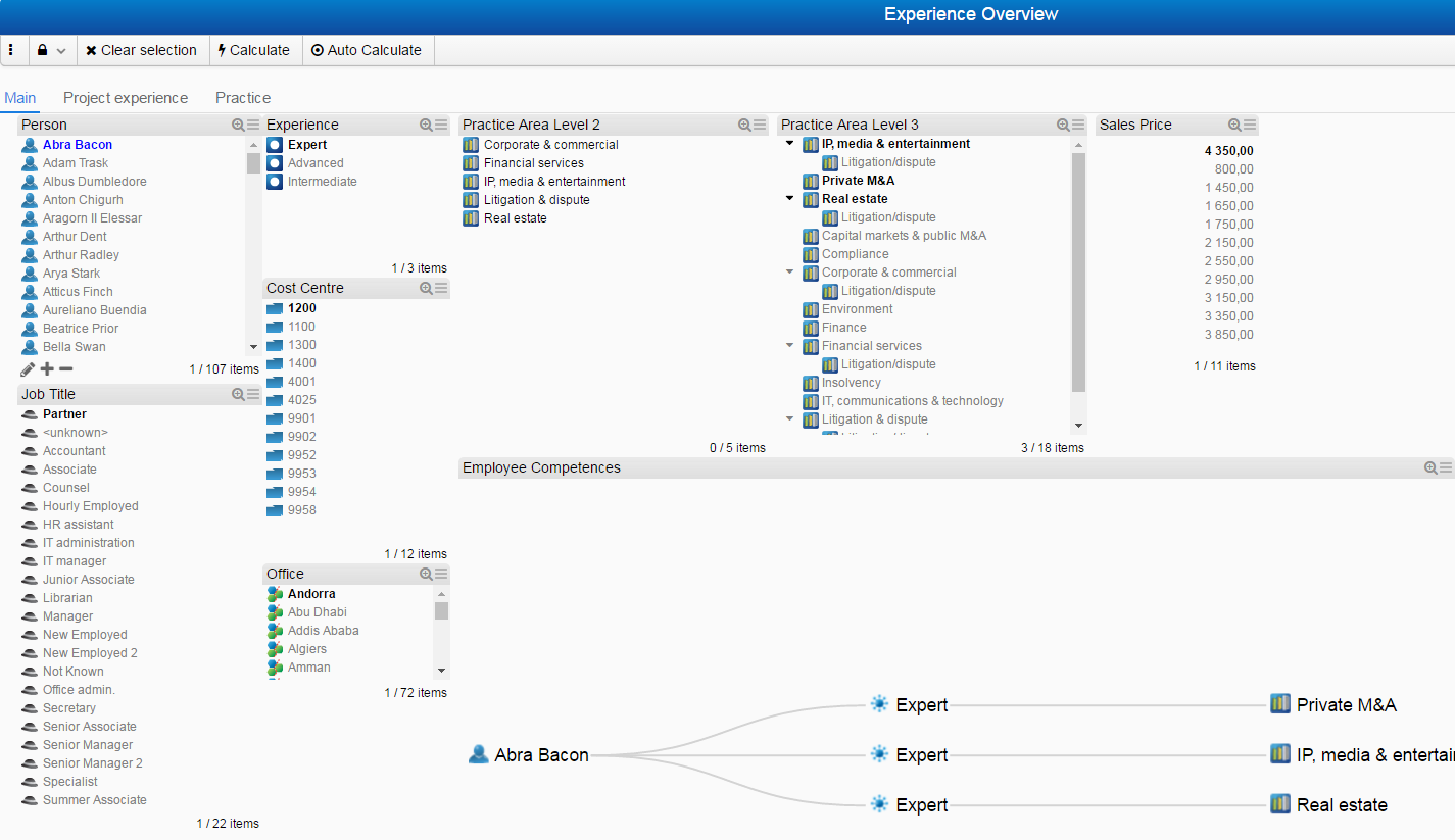
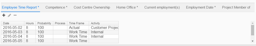
Example: This is a basic Application for employee time reporting, listing employees in p0 and the related time report Associations in p1.
Authorization settings
This settings panel is valid for Associations and their definitions. They will be explained in the following sections.
Association Definition
|
Setting
|
Description
|
|---|---|
| Create | Authorized to create a new object |
| Subclass | Authorized to subclass, i.e. create sub levels of Association Definition(s) |
| Read | Authorized to view an object |
| Update | Authorized to update an object |
| Delete | Authorized to delete an object |
| Copy | Authorized to copy an object |
| Bookmark | Authorized to Bookmark an object |
Associations
|
Setting
|
Description
|
|---|---|
| Create | Authorized to create a new object. It is possible to define one or more definitions to use as a template for the new Association. When creating the new Association on the web, choose the appropriate Association Definition from a drop-down list. |
| Subclass | Not allowed |
| Read | Authorized to view an object |
| Update | Authorized to update an object |
| Delete | Authorized to delete an object |
| Copy | Authorized to copy an object |
| Bookmark | Authorized to Bookmark an object |
Web Layout options
|
Option
|
Description
|
|---|---|
|
Option
|
Description
|
| Header Visible | Title bar visible or not |
| Footer Visible | Footer visible or not. This setting also have an effect on visibility for Counter and Edit buttons |
| Search Field Visible | Search field visible or not |
| Counter Visible | Counter visible or not. The counter show selected/all items in filter component.
It is required that Footer visibility is enabled. |
| Edit Buttons Visible | Edit buttons visible or not. It is required that Footer visibility is enabled.
These options availability is dependant of settings in Authorization . |
| Search Button Visible | Decides whether or not the Search field should be visible by default. There is a dependency to Header setting. |
| Menu Visible | This setting activates a Menu in the Header with the available options as defined in Authorization settings |
| Compact | Show the Filter component as a Combobox. Only applies on Filter components. |
Working with Associations on Web
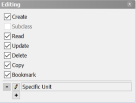
Example: The filter component holds the Editing options as specified in Application Builder
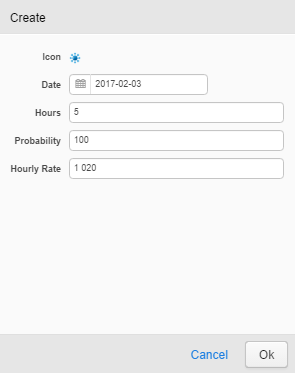
Create new Association
Select the option Create to create a new Association:
The attributes depend on which definition was selected in the Definition drop-down list, in this particular case there is only one definition and need not to be displayed (Employee Time Report).
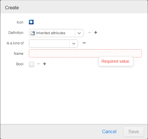
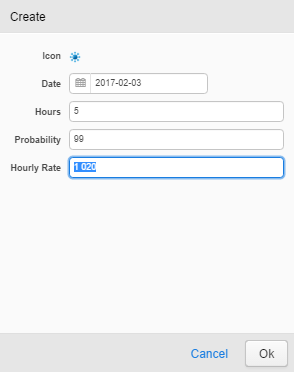
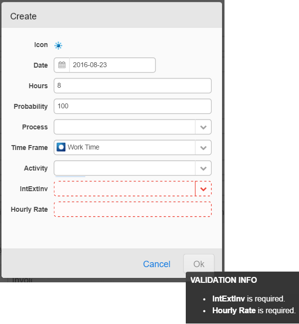
Mandatory values are indicated with a border around the value field, and when all (mandatory) values have been inserted, the Save button will be enabled as can be seen in the next picture.
Open Association
The context menu option Open has two different states dependant whether or not the user has the rights to Read or Update objects in inorigo® Model Builder. If the user has the authorization to update, the context menu option Open will open in Edit mode, enabling the user to perform changes on object.
Example: the user is authorized to make changes on opened objects
The presentation defined in the Connections tab in inorigo® Model Builder is used to display the new Association in Filter component.
Delete Association
There are different levels of dialogues presented to user when performing operations, not to introduce obstacles, but rather to help understand what is going on.
ERROR = Display a confirm dialog and Cancel the operation.
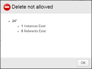
Typically displayed when deleting an object with references to other objects.
WARNING = Display a dialog with two options, to Continue or Cancel.
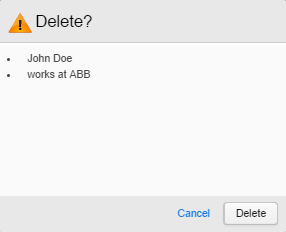
Typically displayed when deleting an object with no references to other objects. If Instance Presentation is used in the definition of attributes, this will be presented as well with its originating perspective.
INFORMATION = Display a confirm dialog and continue the operation.
Typically displayed when cancelling an ongoing operation to copy or create an object.
Open Association Definition
The Association Definition object presentation on the web can easily be recognised from the General tab in Inorigo® Model Builder, with the difference that the presentation is also displayed and editable if user is authorized to:
Subclass Association Definition
An Association Definition may be inherited, i.e. you are able to create new definitions which is a kind of the original one. This behaviour is the same as for all definitions in Inorigo®. Make sure you are able to create a Classifies / Is a kind of-relation between Association Definitions; add the relation in the Relation Specifier / Admin-tab.
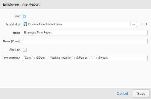
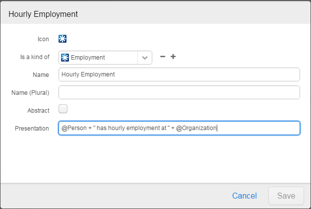
Example, the difference between an Employment– and Permanent Employment-instance could be a) it has a new attribute –Employment ID and b) the presentation from an organisation’s point of view has changed, i.e. the ID is displayed first.
When creating new associations based on the Hourly Employment-definition you will see that the presentation is same as in the parent Definition, and that the new instances are grouped in a separate bundle in Inorigo® Model Builder.
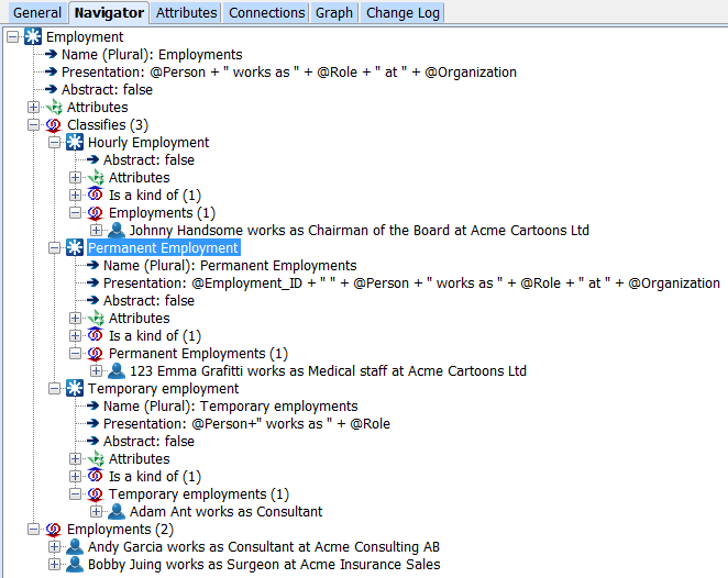
Redesigning the Application to support creating new Hourly Employments would be done in an instant:
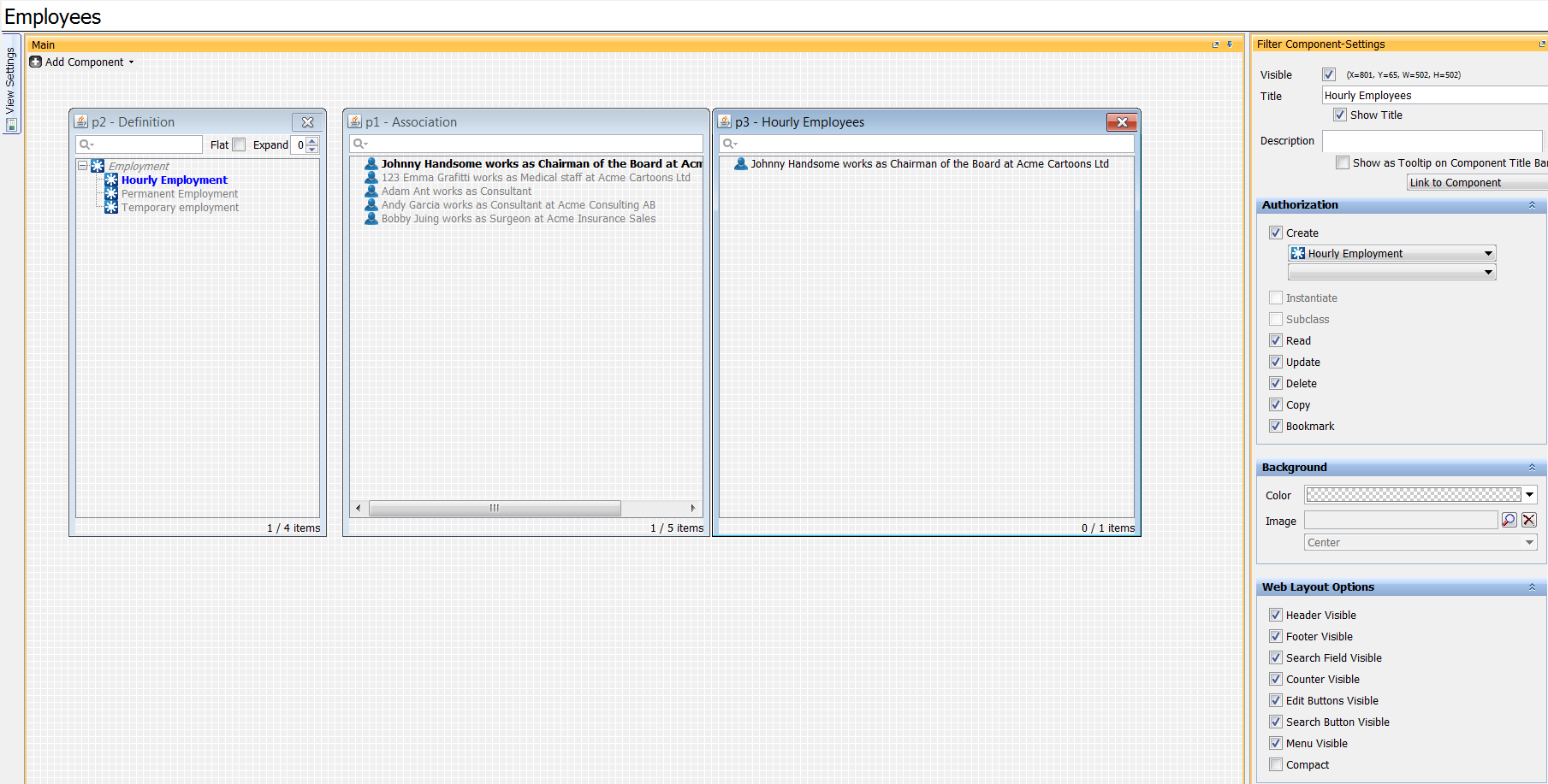
Example: adding a new filter component listing Hourly employees with the ability to Create, Update and delete
Changing the presentation on the web would be as easy as copying the parent presentation and modify to fit purpose of the “Hourly Employment” Association Definition:
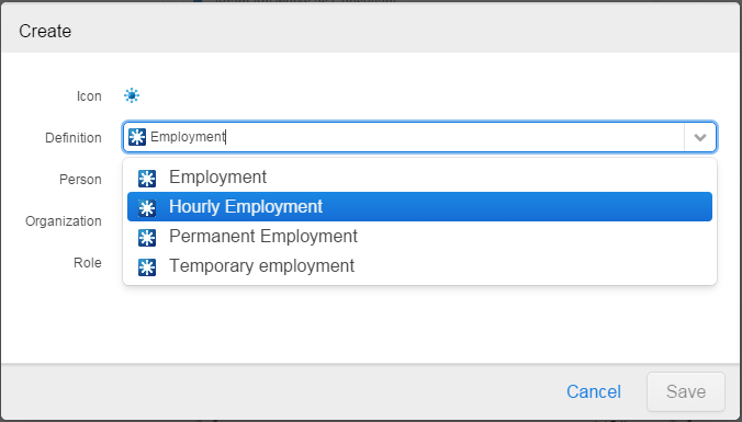
Please note that it is possible to Create a new hourly employment from the ‘All employees’ box as well, since the ‘Hourly employee‘ has a ‘Is a kind of” relation to ‘Employee‘, thus making it possible to change the definition to use when creating a new employee:
Contraints violation
The Attribute Value Panel checks for constraint violations as specified in inorigo® Model Builder.
Managing Resources on the Web
The operations available for Resources on the web is determined by the Authorization settings in Application Builder.
Authorization settings
This settings panel is valid for only Resources, since it cannot have a Definition nor Instances or Subclasses.
|
Setting
|
Description
|
|---|---|
| Create | Authorized to create a new object |
| Subclass | Not allowed |
| Read | Authorized to view an object |
| Update | Authorized to update an object |
| Delete | Authorized to delete an object |
| Copy | Authorized to copy an object |
| Bookmark | Authorized to Bookmark an object |
Furthermore, the accessibility of these options are decided by the Web Layout Options.
Web Layout Options
|
Option
|
Description
|
|---|---|
| Header Visible | Title bar visible or not |
| Footer Visible | Footer visible or not. This setting also have an effect on visibility for Counter and Edit buttons |
| Search Field Visible | Search field visible or not |
| Counter Visible | Counter visible or not. The counter show selected/all items in filter component.
It is required that Footer visibility is enabled. |
| Edit Buttons Visible | Edit buttons visible or not. It is required that Footer visibility is enabled.
These options availability is dependant of settings in Authorization . |
| Search Button Visible | Decides whether or not the Search field should be visible by default. There is a dependency to Header setting. |
| Menu Visible | This setting activates a Menu in the Header with the available options as defined in Authorization settings |
| Compact | Show the Filter component as a Combobox. Only applies on Filter components. |
However, these options are accessible through the context menu on objects – mouse right-click.
- The Header menu is activated in Web Layout options. Some options require an object is selected in filter box list.
- The Context menu is always active with more or less options available, depending on settings in Authorization settings
- Edit buttons are enabled in the Web Layout Options settings. Some options require an object is selected in filter box list.
Open/Edit Resource
If Open, and not Update is activated in Authorization settings, the object is opened as read-only with all its properties. If also Update is enabled, it is possible to update properties of object that is not part of the standard objects, i.e. objects added by user.
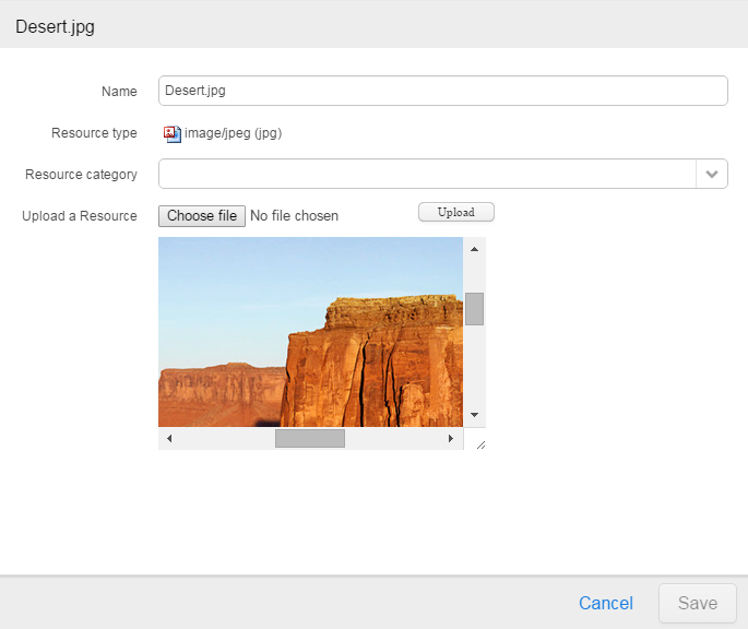
It is possible to change Name, set a Resource category and to change the file.
Create new Resource
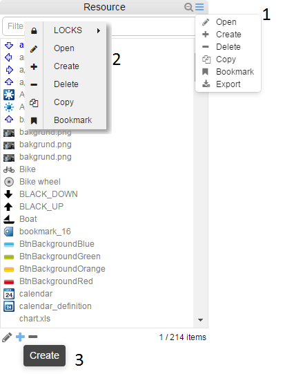
There are a few options when creating a new object. First thing is to use the Create option(s) available, which will open a modal window.
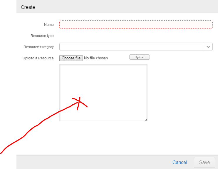
One option to add a new Resource is to simply drag the object into the area as illustrated in the image above. The Name and Resource type will automatically be set for you. File is automatically uploaded, so the only thing left to do is Save.
The other option is to press the Choose file button to select a source from any location. A preview is available, and when pressing the Upload button, Name and Resource type will automatically be set. Need only to Save the new Resource.
Delete Resource
There are different levels of dialogues presented to user when performing operations, not to introduce obstacles, but rather to help understand what is going on.
ERROR = Display a confirm dialog and Cancel the operation.
Typically displayed when deleting an object with references to other objects.
WARNING = Display a dialog with two options, to Continue or Cancel.
Typically displayed when deleting an object with no references to other objects. If Instance Presentation is used in the definition of attributes, this will be presented as well with its originating perspective.
INFORMATION = Display a confirm dialog and continue the operation.
Typically displayed when cancelling an ongoing operation to copy or create an object.
Copy Resource
The operation Copy will make an exact copy of the original object, part from the file name that will get a prefix “Copy_of_”.
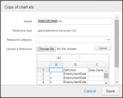
Need only to change name before saving new resource.
Bookmark Resource
The Bookmark option will only be available when an Application is opened through the inorigo® Workbench. The bookmark is saved in the bookmarks panel in the Workbench.
Resource as Attribute
The editor on web for managing Resources as attributes on other inorigo objects
Click on the Resource picker to open the editor:
|
Item
|
Description
|
|---|---|
| Resource | name of the attribute of type Resource |
 |
Resource editor button. Will hold a miniature icon when a Resource have been selected. |
 |
Select an object in the drop-down list of available objects in inorigo |
 |
Download the Resource to the destination configured for browser |
 |
Pick a file from any source location using the computer explorer |
 |
Upload the selected resource |
Managing Specific Units and Their Definitions
Application Builder Configuration for Units
The examples below is based on a simple inorigo® Application illustrated in image below:
Example: This is a very simple example
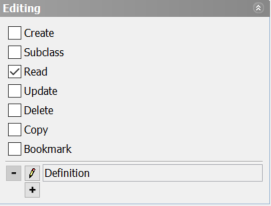
Authorization settings
This settings panel is valid for Specific Units, Generic Units and Generic Types. They will be explained in the following sections.
Generic Type
|
Setting
|
Description
|
|---|---|
| Create | Authorized to create a new object |
| Subclass | Authorized to subclass, i.e. create sub levels of Generic Type(s) |
| Read | Authorized to view an object |
| Update | Authorized to update an object |
| Delete | Authorized to delete an object |
| Copy | Authorized to copy an object |
| Bookmark | Authorized to Bookmark an object |
Generic Unit
|
Setting
|
Description
|
|---|---|
| Create |
Authorized to create a new object. When creating the new Generic Unit on the web, choose, if applicable, the appropriate Generic Type from a drop-down list. Generic Units definitions If the filter component shows Generic Units, one or more definitions (Generic Types) can optionall |
| Subclass | Authorized to subclass, i.e. create sub levels of Generic Unit(s) – a classifies relation. |
| Read | Authorized to view an object |
| Update | Authorized to update an object |
| Delete | Authorized to delete an object |
| Copy | Authorized to copy an object |
| Bookmark | Authorized to Bookmark an object |
Specific Unit
|
Setting
|
Description
|
|---|---|
| Create | Authorized to create a new object. It is possible to define one or more definitions to use as a template for the new Specific UnitWhen creating the new Specific Unit on the web, choose the appropriate Generic Unit from a drop-down list. |
| Subclass | Not allowed |
| Read | Authorized to view an object |
| Update | Authorized to update an object |
| Delete | Authorized to delete an object |
| Copy | Authorized to copy an object |
| Bookmark | Authorized to Bookmark an object |
Web Layout options
Applies for Specific and Generic Units, as well as GenericTypes.

|
Option
|
Description
|
|---|---|
| Header Visible | Title bar visible or not |
| Footer Visible | Footer visible or not. This setting also have an effect on visibility for Counter and Edit buttons |
| Search Field Visible | Search field visible or not |
| Counter Visible | Counter visible or not. The counter show selected/all items in filter component.
It is required that Footer visibility is enabled. |
| Edit Buttons Visible | Edit buttons visible or not. It is required that Footer visibility is enabled.
These options availability is dependant of settings in Authorization . |
| Search Button Visible | Decides whether or not the Search field should be visible by default. There is a dependency to Header setting. |
| Menu Visible | This setting activates a Meny in the Header with the available options as defined in Authorization settings |
| Compact | Show the Filter component as a Combobox. Only applies on Filter components. |
Units on the Web
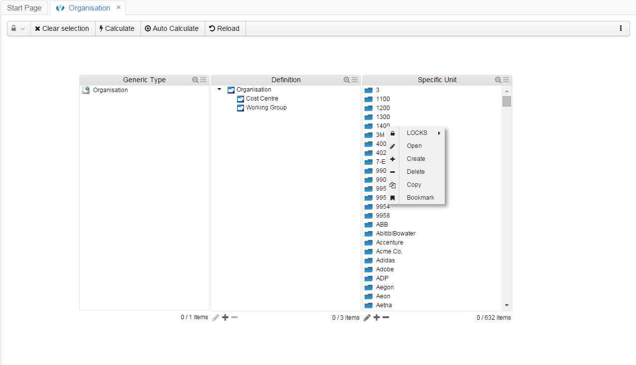
Example: The right-most filter component holds the options as specified in Application Builder
Create new Specific Unit
Select the option Create to create a new Specific Unit (Organisation):
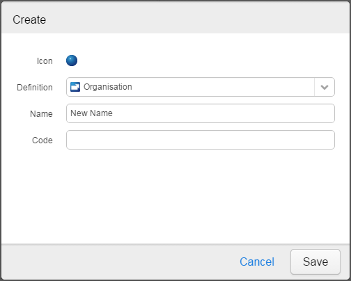
The attributes depend on which definition was selected in the Definition drop-down list
Specific Units definition(s)
If the filter component shows Specific Units, one or more definitions (Generic Units) must be specified. If one or more definition(s) is specified, a definition “attribute” will appear on the Attribute Value Panel showing the available definitions. If no definition is specified, an error will be exposed when creating a new Specific Unit.
Mandatory values, if any, are indicated with a border around the value field. Need not to specify a name for a Specific Unit, a unique ID will be created upon save, but it is advisable to specify a descriptive name.
Open Specific Unit
The context menu option Open has two different states dependant whether or not the user has the rights to Read or Update objects in inorigo® Model Builder. If the user has the authorization to update, the context menu option Open will open in Edit mode, enabling the user to perform changes on object.
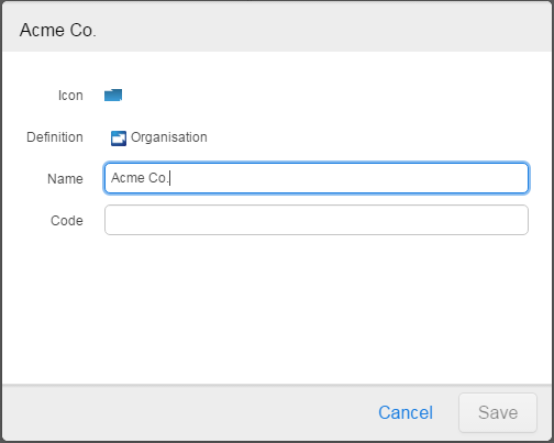
Example: the user is authorized to make changes on opened objects
The presentation defined in the Connections tab in inorigo® Model Builder is used to display the new Specific Unit in Filter component.
Delete Specific Unit
There are different levels of dialogues presented to user when performing operations, not to introduce obstacles, but rather to help understand what is going on.
ERROR = Display a confirm dialog and Cancel the operation.
Typically displayed when deleting an object with references to other objects.
WARNING = Display a dialog with two options, to Continue or Cancel.
Typically displayed when deleting an object with no references to other objects. If Instance Presentation is used in the definition of attributes, this will be presented as well with its originating perspective.
INFORMATION = Display a confirm dialog and continue the operation.
Typically displayed when cancelling an ongoing operation to copy or create an object.
Working with Generic Units on the web
Need not have Definition
Generic Units need not to have a Definition while being classified by another Generic Unit. The Definition field is not displayed when Definition is not specified in inorigo® Application Builder settings.
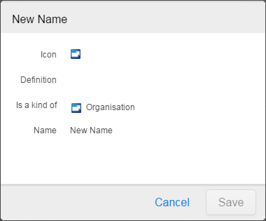
Open/Read Generic Unit
The Generic can have a definition, but must not have.
If the user is Authorized, it is possible to change Definition and Name (Update, see below).
Example of an object opened in Readonly mode
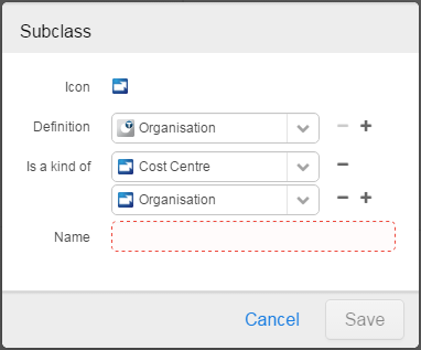
Subclass Generic Unit
Now, Subclass a Generic Unit means that you will create a classification structure that can be visualized in a Filter Component.
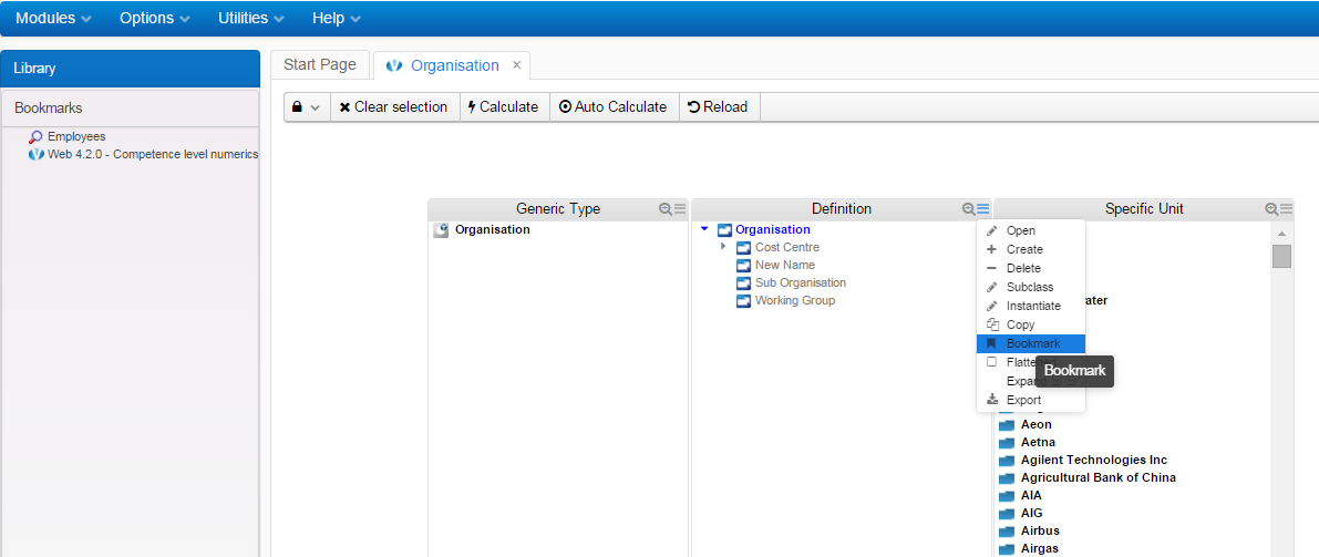
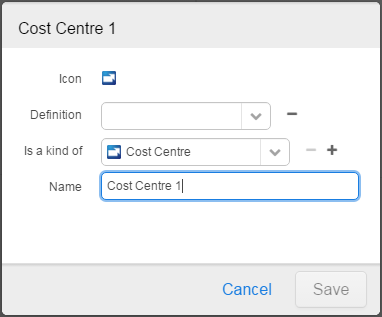
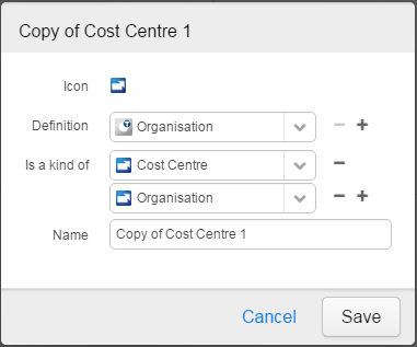
Add the “Cost Centre 1” Generic Unit as Subclass to Cost Centre:
Example
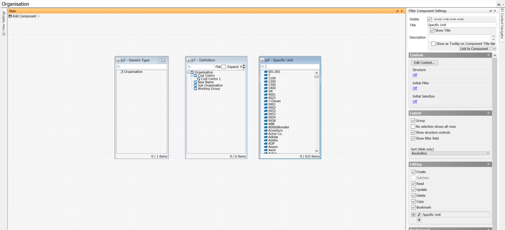
The new Generic Unit might not appear in the tree under Organisation, and the reason for that might have to do with filter settings, only allowing units used by any Specific Unit – the Generic Unit filter component is linked from Specific Unit filter component. To show items not yet connected to a Specific Unit, un-tick the checkbox “Show connected items only” and edit the filter box Relations to include items that “Is a kind of” Generic Unit “Organisation”.
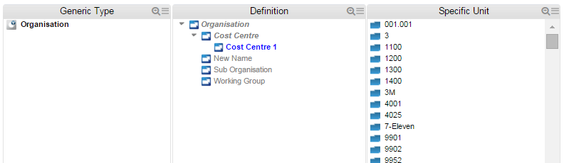
This example shows it is possible to display items not yet having a relation with a Specific Unit (Definition box is linked from Specific Unit box).
Update Generic Unit
When authorized by settings in inorigo® Application Builder, it is possible to update all fields not locked by any Readonly or Fixed Value setting in inorigo® Model Builder, even set or change the Definition.
Delete Generic Unit
There are different levels of dialogues presented to user when performing operations, not to introduce obstacles, but rather to help understand what is going on.
ERROR = Display a confirm dialog and Cancel the operation.
Typically displayed when deleting an object with references to other objects.
WARNING = Display a dialog with two options, to Continue or Cancel.
Typically displayed when deleting an object with no references to other objects. If Instance Presentation is used in the definition of attributes, this will be presented as well with its originating perspective.
INFORMATION = Display a confirm dialog and continue the operation.
Typically displayed when cancelling an ongoing operation to copy or create an object.
Copy Generic Unit
When executing the Copy operation, Name is preset to “Copy of …“.
Bookmark Generic Unit
It is possible to Bookmark any inorigo object in any filter component when Authorization settings in inorigo® Application Builder allow. There are two ways of performing the operation; either right-click the object and use the Context menu to Bookmark, or use the Menu on title bar. Both alternatives produce the same result; Bookmark is created in the Bookmarks panel.
Please note that Bookmarks option is only available when an Application is opened in the inorigo® Workbench.
Create a Bookmark from the context menu
Create a Bookmark from the title bar Menu
Working with Generic Types on the web
Generic Types are pretty much the same as Generic units, with the main difference that a Generic type cannot have a Definition since this is the top level in the Generic Model.
Warnings and Confirmations
There are different levels of dialogues presented to user when performing operations, not to introduce obstacles, but rather to help understand what is going on.
ERROR = Display a confirm dialog and Cancel the operation.
Typically displayed when deleting an object with references to other objects.
WARNING = Display a dialog with two options, to Continue or Cancel.
Typically displayed when deleting an object with no references to other objects. If Instance Presentation is used in the definition of attributes, this will be presented as well with its originating perspective.
INFORMATION = Display a confirm dialog and continue the operation.
Typically displayed when cancelling an ongoing operation to copy or create an object.
Transaction errors and warnings are always reported using a Validation Category, accompanied with a detailed message and the ID of the unit causing the error or warning.
The HTTP response code will be 400 (Bad Request) for all categories except for Rights related issues, where the 403 (Forbidden) response code will be returned.
Categories in Italic are currently not in use.
Validation Categories:
- System: System or core related problem, raised when trying to delete a non existent unit or adding a unit with the same ID twice.
- HumanKey: Raised as warning when trying to add units (Definitions, resources etc) with duplicate names.
- AttributeValue: Raised when an attribute value is wrong.
- AttributeMultiplicity: Raised when an attribute has the wrong number of values.
- RelationMultiplicity: Raised when a relation is missing or occurs the wrong number of times.
- InstancesExist: Raised when trying to delete a definition with existing instances.
- ReferentsExist: Raised when trying to delete a unit when other units refer to the unit via an attribute value.
- SubclassesExists: Raised when trying to delete a definition with existing sub classes or implementing definitions.
- PartnersExists: Raised when trying to delete a unit when other units refer to the unit via a relation.
- DefinitionMultiplicity: Raised when violating the allowed number of definitions or super classes.
- DefinitionValue: Raised when the definitions are invalid, such as an illegal combination of super classes and sub classes.
- ConstraintViolation: Raised when a user defined constraint is violated.
- Rights: Raised when trying to execute a forbidden operation, protected by AuthRecords.
- Group: Used for grouping errors in case of nested units.
Nesting and Nested Units on the Web
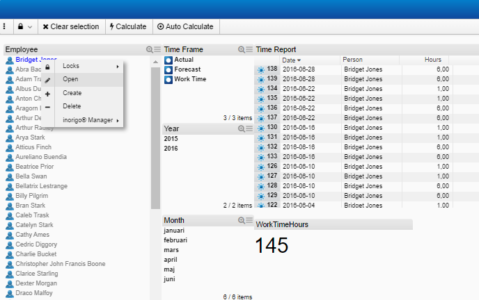
The common item used as a Nesting Unit is found in the upper left corner of the Application. Having enabled the Editing options Create, Update and Read for this Filter Component, will give a user, with the right authorization options, access to create and update items on the web.
Use any option, button, menu or context menu, to open an item in the Person Filter component:
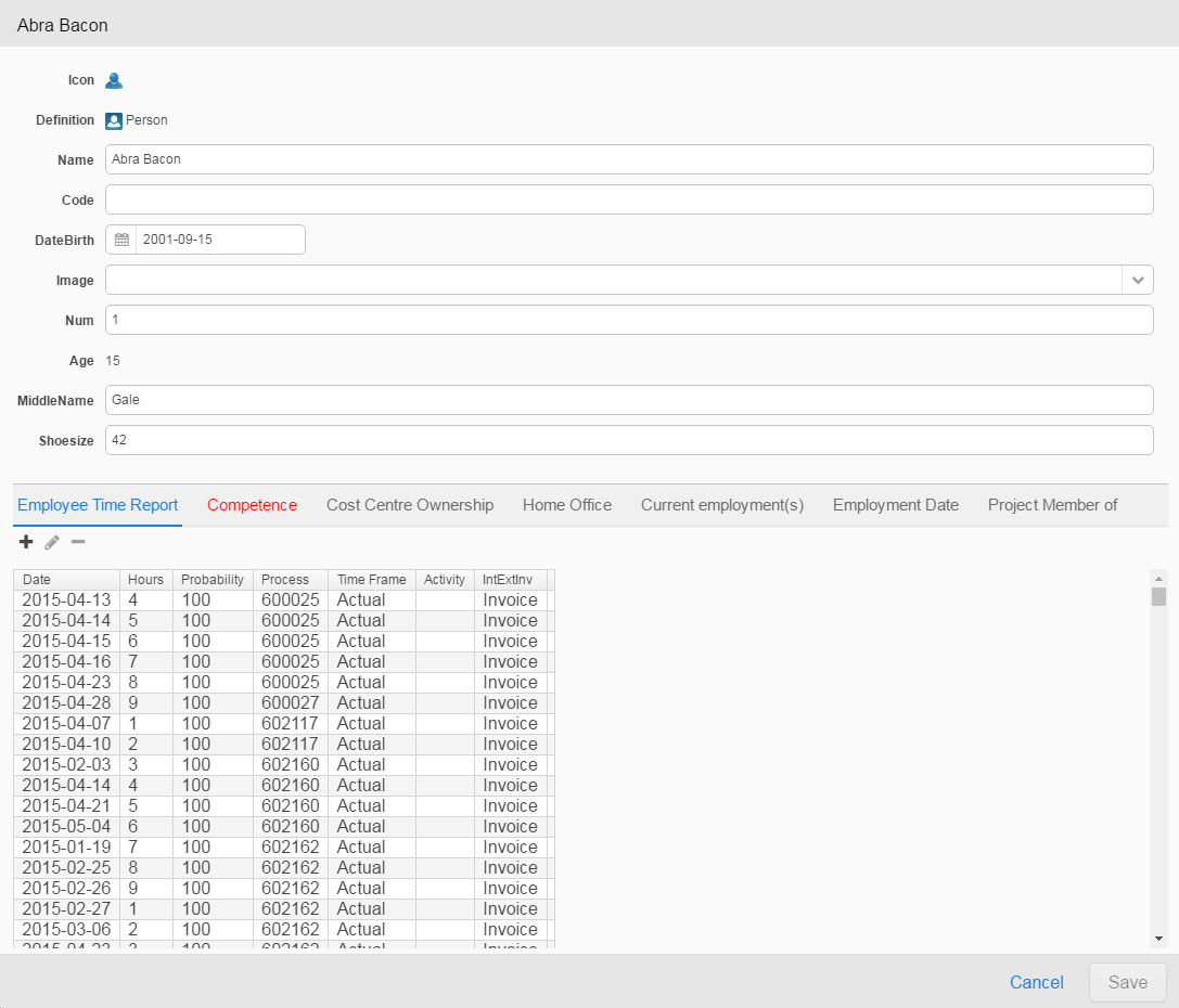
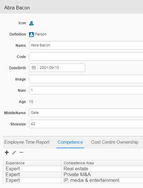
In the lower section of panel, the Nested Units are listed in different tabs in the order specified in the inorigo® Application Builder setup, the leftmost one being in focus, indicated with blue color.
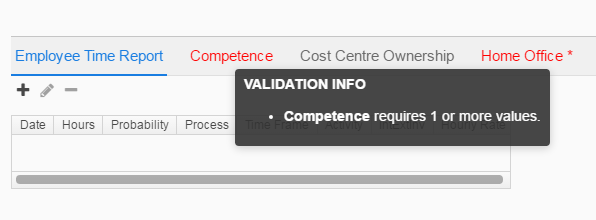
If attribute value(s) for an object is not complete or wrong, this is indicated in panel with red color. In the image above, there seem to be something wrong with Competence. Bringing this item in focus and comparing with the setup in inorigo® Application Builder;
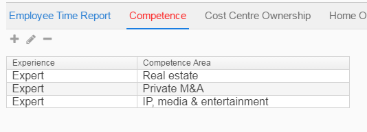
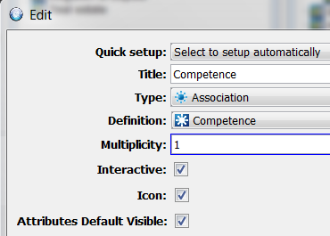
Yes, it should definitely be possible to have more than one Competence, so changing the default multiplicity from 1 to 1.. would sort out that problem.
The Nested Units panel is somewhat dynamic, which means that the multiplicity for Nested Unit will control the visibility for buttons and how the Nested Unit(s) is presented (defined in Application setup);
|
Multiplicity
|
Description
|
|---|---|
| 0.. | Edit buttons will be visible and Nested Units are presented in a list. |
| 0..1 | Edit buttons will be visible and Nested Unit is presented in a list |
| 1 | Edit buttons will NOT be visible and Nested Unit is presented/selected in a drop down list |
| 1.. | Edit buttons will be visible and Nested Units are presented in a list |
| 2..3 | Edit buttons will be visible and Nested Units are presented in a list |
The main advantage, not having to Create or Update several filter components to complete a new Person (in this example seven Association boxes) and in a particular order, is that one need only to manage one object and the other will be completed in the same panel.
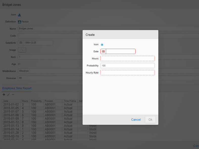
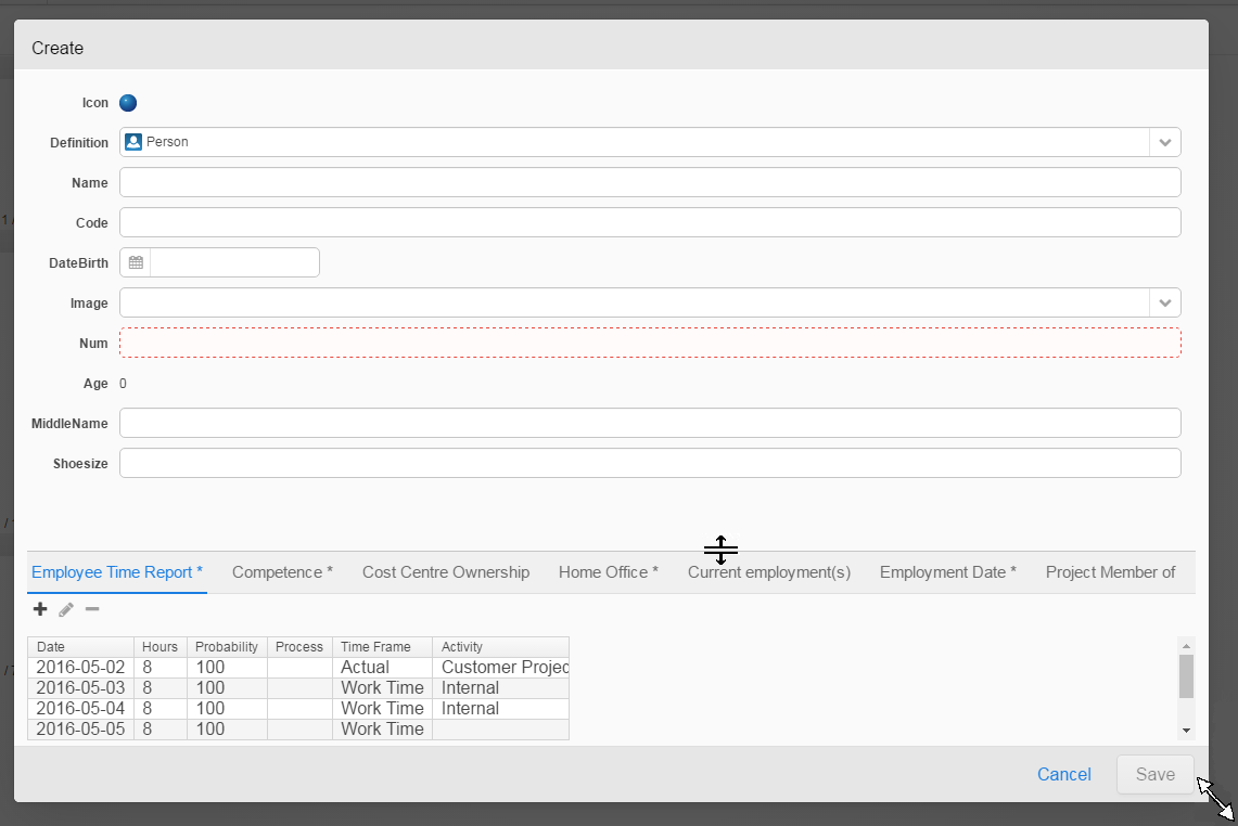
Create a new Person
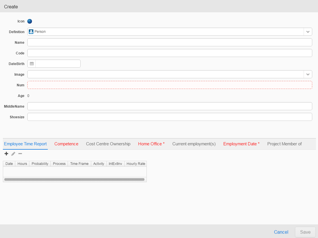
It is clearly indicated which attributes for Person that are mandatory, and also the Nested Unit values are clearly indicated. The Save button will not be enabled until all mandatory values have been entered. Every item being changed since last save will be indicated with an asterisk (*) for easy tracking.
Hovering the Nested Units will display the multiplicity for the item required.
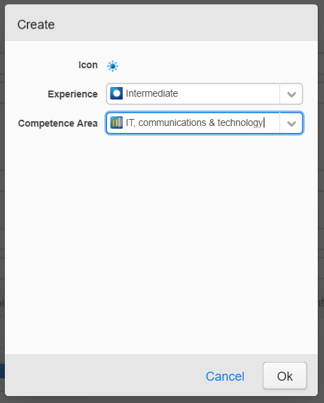
Switching tab to Competence, press the + button to add a competence will open the Create new (competence) panel:
Depending on the multiplicity of the Nested Unit, the item(s) can be shown in one of two ways;
When the multiplicity is set to 1:
there will be a combobox to select attribute value from. No extra panel is required to add the one value.
When the multiplicity is set to, e.g. 1.. a new panel is opened to add the new value:
and the values will be listed in a matrix.
It is possible to resize the Create new panel, and also to move the splitter between Nesting Unit and Nested Unit(s); simply hover the divider to change the proportions or hover the lower right corner to resize the entire panel. The mouse pointer will change appearance when in correct position for operation.
When all mandatory information for both Nesting Unit and Nested Unit have been entered, the Save button will be enabled.
The Application will immediately be updated with the new information.
Application update
There are situations where an Application might not be updated; extensive calculations might delay the update in the Application or the Application is configured for Manual update.
Pre-selected Nested Unit
A feature worth mentioning; if the user explicitly select one value in a filter box and that item is included in the valueset for a Nested Unit attribute, that value is set as default when creating a new unit. If any default value has been defined in the Application Builder configuration, the selected value on web will override this default value.
Stale Application Indicator
Reload Mode
Reload Mode can be configured per Application. This controlled by the System Administrator and manages the Application load into server memory and how the Application indicator should behave.
To be able to watch an Application in a browser, the Application needs to be loaded into server memory, using data from the database and data on how the components are laid out. For a complex Application with many filter components, holding tens of thousands of inorigo® objects, this might be a time consuming task to perform. The loading of a new version of an Application takes place in the background on server. When the Application is (re)loaded on the server, the loading of the fresh Application in the browser is instant.
For the end user watching an Application in a browser it is important to know the meaning of the indications that could appear the Application in the upper right corner;
|
Image
|
Operation
|
Description
|
|---|---|---|
|
Image
|
Operation
|
Description
|
 |
– | This indicates the current Application is up to date |
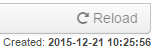
 |
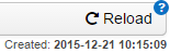
Press the button to initiate a Reload of the Application into server memory. If the rebuild of the Application is fast, it will be updated directly in browser. The button will be disabled when an Application is current or a rebuild of an Application is in progress on server(*). | This indicates that a current Application is possibly stale. Someone has made a change somewhere that directly might affect the Application. If changes does not affect the Application, button will just be disabled.
If an Application is affected, other users watching the Application will be notified that there is a newer version of the Application in server memory. |
 |
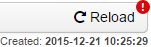
Press the button to fetch the updated Application instantly.
Selections in filter boxes are kept. and this might be time consuming if calculations are massive. |
This indicates that the reload of the Application on the server is finished, and there is a newer version of the Application available in the server memory.
In this state, it is important that user press this button to minimize the number of versions of Application that is kept in memory. |
 |
Press the button to re-calculate Application. | This indicates there are changes outside Application configuration in legacy that might affect the Application calculations, e.g. another user viewing the same Application on the web has made changes that might affect the calculations. |
The time-stamp indicates when the Application was created.
(*) If the reload of an Application into server memory takes too long, an information pop-up will appear:
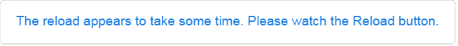
When the reload into server memory is done, the Reload button will look like this:
Communication Lost Indication
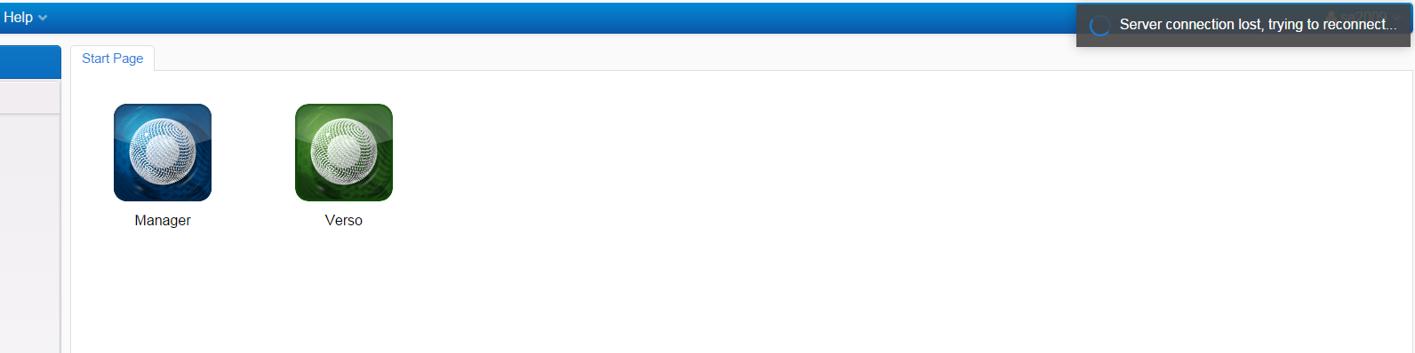
The pop-up in the upper right corner in an Application or in the Workbench will appear due to either one or both of the following reasons:
- disconnected from network
- Tomcat service or server hosting the Tomcat service has been shut down or rebooted
When connection has been established again it looks like in the following image when trying to access an Application:
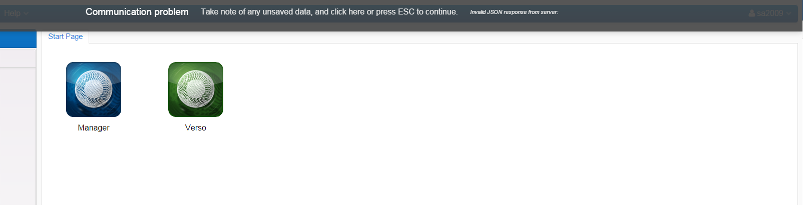
Click on the “Communication problem” banner, press Esc button on keyboard or reload the web page (F5) to refresh the web page.